22 nov 2019
13 nov 2019
CALIBRATION AND MONITORING PROCESS

Preparing Slides for the FOSS NIR FORUM 2019. Hope to explain fine all these concepts
25 oct 2019
How the number of inputs affects the results in a NIR ANN Calibration
Developing a ANN calibration for ash in meat meal today with Foss Calibrator I realize of the importance of the right selection of inputs in the network. If we take few inputs we can underfit the model and the results could be a bias in the predictions. So prepare a batch mode and don´t be afraid to select a wide range to the limit which in this case is 30. We will get a Heat Map showing the best option for the number of inputs as well for the number of hidden neurons.
First I select the default options and I got a bias validating with an independent set. After I make wider the batch for the input layer and the bias disappear with 30 inputs.
Validation with 22 inputs:

Heat mat recommendation with a wider batch:

22 oct 2019
Expand product library with new spectra
One way to expand a calibration is with the option "Expand a product library with new spectra" included in the "Make and use scores" option of Win ISI.
We have a library file (cal file) with the samples we have use to develop a calibration. We have also the ".pca" files and ".lib" files which are giving us the GH and NH values.
Now we have new samples analyzed after installing this equation in routine, and we want to select the samples which can expand the calibration in order to make a more robust model. This selection is based on the NH distances, so the calibration will select empty spaces in the LIB file and will expand the PCs in other directions in the case we get new variability.
To expand the library we need the P and T matrices of the current library and the ".nir" file of the new spectra with the candidates to expand and fill the current database. We can stablish a certain cutoff for the NH limits, being 0.6 the default.

In this case of the total 46 samples 21 have a NH value higher than 0.600, so they are selected to expand the calibration. 5 samples are similar to the samples we have in the library we have use to develop the current calibration with their ".pca" and ".lib" files and these 5 samples have a "L" at the end. Finally 20 samples are similar to the selected ones, so it does not make sense to choose them, because they are redundant with the selected ones, this samples have an S at the end,
So we can send this samples to the lab to create a new cal file that we will merge with the current cal file to expand the calibration.
10 oct 2019
15 sept 2019
TUTORIAL FOSS CALIBRATOR VIDEO 003 (actualizado)
Este video muestra como calcular los PCA y PLS con los "logical sets", también sirve como introducción al desarrollo de modelos de calibración con las opciones recomendadas o bien con la configuración que nosotros consideremos conveniente.
12 sept 2019
TUTORIAL FOSS CALIBRATOR VIDEO 002 (actualizado)
Continuamos a partir de donde lo habíamos dejado en el video 1 donde habíamos encontrado ocho anómalos espectrales (4 de ellos encontrados fácilmente de forma visual y otros cuatro por análisis de componentes principales. Ahora se trata de inspeccionar de si tenemos datos sospechosos de ser anómalos en lo que se refiere al dato de laboratorio, por lo que sin llegar a hacer los modelos observamos las rectas de regresión de cada uno de los parámetros y también los scores y loadings de PLS. Señalaremos las muestras sospechosas para que podamos examinarlas y en caso necesario excluirlas del modelo de calibración que desarrollaremos en los próximos videos.
25 ago 2019
See the NIR Latex Validation report created with Sweave
NIR Validation Report based on ISO12099 (click to see pdf)
24 ago 2019
Using "Sweave" and "Latex" with the Monitor function
Finally I can find the best configuration for "Sweave" in "R" to generate the Validation Reports with the Monitor function. Still some more improvements are needed, but I am quite happy with the results.


7 ago 2019
Looking the Residual plot taking into account the Boxplot
I have improved the Monitor function just to give more importance to the Box plots. So we can see simultaneously the boxplot and the residual plots and to have more clear ideas about the performance of the model. I have more ideas coming so I hope to complete it in a future.
As we know the box plot give us the median and limits for the quartiles. It defines also the limits to consider where a sample is an outlier. So I divide the samples in 5 groups (Q1 to MIN,Q1,Q2,Q2 to MAX and BPOUT) depending of their value in the boxplot.
If the samples are ordered in the residual pot by their reference value we get:

 It is important to order the data by date and we can get other conclusions:

Spending time looking to these plots we can get some conclusions to improve the model to make it more robust.
As we know the box plot give us the median and limits for the quartiles. It defines also the limits to consider where a sample is an outlier. So I divide the samples in 5 groups (Q1 to MIN,Q1,Q2,Q2 to MAX and BPOUT) depending of their value in the boxplot.
If the samples are ordered in the residual pot by their reference value we get:


Spending time looking to these plots we can get some conclusions to improve the model to make it more robust.
24 jul 2019
GOOD PRODUCT EVALUATION
When we create a Good Product Model we want to test it with new samples knowing if they are good or bad. There is of course an uncertain area that we can calculate from experience we get from several evaluation.
In this Excel plot we see the values for "Max Peak T", for the training set (samples before Mars 2019) and new batches we consider are fine from Mars to June. There is a set of bad samples prepared with mixtures out of tolerance for a certain component or components of the mixture.
As we can see the model works in some cases but there are other that are misclassified, so we have to try other treatments or models to check if we can classify them better. Anyway there is always an uncertain zone and we have to check for confidence levels of the prediction.

22 jul 2019
Looking for problems in the Residual plots
Control charts or residual plots are very helpful to detect problems, and we have to look at them always to try to understand how well our model performs. It is important tp have a certain order ibn the X axis to succeed in the interpretation. In this case is in order by the value of the reference, but the order can be by date, by GH,....
There are different rules and we have to check them. One rule is that there must not be nine points or more in a row on the same side of the zero line, and this is what it happens in this case for a model where the Monitor functions show that there is a problem with the slope.

Look from left to right and see how more than nine points (red) in a row are over the zero line. Once corrected (yellow points) the distribution improves.
25 jun 2019
More about Mahalanobis distance in R
There are several Mahalanobis distance post in this blog, and this post show a new way to find outliers with a library in R called "mvoutlier".
Mahalanobis ellipses can only be shown in 2 dimensions with a cutoff value as we have seen, so we show the maps of scores 2 by 2 for the different combinations of PCs, like in this case for PC1 and PC2 and we can mark the outliers in the plot by the identify function:

In this case I mark some of the samples out of the Mahalanobis distance cutoff. Anyway the Mahalanobis distance is univariate and in this case where we have a certain number of PCs, we have to see not just a map of two of them or all at the same time, we need a unique Mahalanobis distance value and to check if that value is over or into the cutoff value that we assign.
For that reason we use the Moutlier function of the "chemometrics" package and show a real Mahalanobis outlier plot which can be Robust or Classical:

We can see the classical plot and identify the samples over the cutoff:

We can see the list of all the distances in the output list for the function. I will continue with more options to check the Mahalanobis distances in the next post.
24 jun 2019
Validation problem (extrapolation)
Sometime when validating a product for a certain constituent (in this case dry matter) we can see this type of X-Y plot:

This a not nice at all validation, but we have to see first that we have like to clusters of lab values for lower and higher dry matter. So the first question is:
Which is the range of the calibration samples in the model which I am validating?.
I check and I see that the range for dry matter in the model is from 78,700 to 86,800, so I am validating with samples more dried than the ones in the calibration.
I see that it seems like bias effect for those samples. Let´s remove the samples in range and check the statistics for the samples out of range:

We see that we have a bias effect, and some slope caused but one of the samples. So this is a new source of variation to expand the calibration. Merge the validation samples to the database and recalibrate. Try to make robust the new model for extrapolation.
14 jun 2019
12 jun 2019
10 jun 2019
3 jun 2019
Understanding Neural Networks
Tony Yiu explore how Neural Networks function in order to build an Intuitive Understanding of Deep Learning.18 may 2019
set.seed function in R and also in Win ISI
It is common to see how at the beginning of some code the "set.feed" function is fixed to a number. The idea of this is to get reproducible results when working with functions which require random sample generation. This is the case for example in Artificial Neural Networks models where the weights are selected randomly at the beginning and after that are changing during the learning process.
Let´s see what happens if set.seed() is not used:
library(nnet)
data(airquality)
model=nnet( Ozone~Wind, airquality size=4, linout=TRUE )
The results for the weights are:
# weights: 13
initial value 340386.755571
iter 10 value 125143.482617
iter 20 value 114677.827890
iter 30 value 64060.355881
iter 40 value 61662.633170
final value 61662.630819
converged
If we repeat again the same process:
model=nnet( Ozone~Wind, airquality size=4, linout=TRUE )
The results for the weights are different:
# weights: 13
initial value 326114.338213
iter 10 value 125356.496387
iter 20 value 68060.365524
iter 30 value 61671.200838
final value 61662.628120
converged
But if we fit the seed to a certain value (whichever you like) .
set.seed(1)
model=nnet( Ozone~Wind, airquality size=4, linout=TRUE )
# weights: 13
initial value 336050.392093
iter 10 value 67199.164471
iter 20 value 61402.103611
iter 30 value 61357.192666
iter 40 value 61356.342240
final value 61356.324337
converged
and repeat the code with the same seed:
set.seed(1)
model=nnet( Ozone~Wind, airquality size=4, linout=TRUE )
we obtain the same results:
# weights: 13
initial value 336050.392093
iter 10 value 67199.164471
iter 20 value 61402.103611
iter 30 value 61357.192666
iter 40 value 61356.342240
final value 61356.324337
converged
SET.SEED es used in Chemometric Programs as Win ISI to select samples randomly:

2 may 2019
Using "tecator" data with Caret (part 4)
I add one more type of regression to the "tecator meat data" in this case is the "Ridge Regression".
Ridge Regression use all the predictors, but penalizes their values in order they can not get high values.
We can see that it not get such as best fitting as the PCR or PLS in the case of spectroscopy data, but it is quite common to use it in other data for Machine Learning Application. Ridge Regression is a type of Regularization where we have two types L1 and L2.
In the plot you can see also the RMSE for the validation set:
 Of course PLS works better, but we must try other models and see how the affect to the values.
Ridge Regression use all the predictors, but penalizes their values in order they can not get high values.
We can see that it not get such as best fitting as the PCR or PLS in the case of spectroscopy data, but it is quite common to use it in other data for Machine Learning Application. Ridge Regression is a type of Regularization where we have two types L1 and L2.
In the plot you can see also the RMSE for the validation set:

30 abr 2019
What are the benefits of adding more data to the models?
One of the frequent questions before developing a calibration is: How many samples are necessary to develop a calibration?. The quick answer is: ¡as much as possible!. Of course is obvious that they should content variability and represent as much as possible the new data can appear in the future.
The main sources of error are the "Irreducible error" (error from the noise of the instrument itself), the unexplained error (variance) and the Bias and they follow some rules, depending of the number of samples we have. Another thing to take into account is the complexity of the model (the number of coefficients, parameters, or terms we add to the regression).
Let´s look to this plot:

Now, if we add more samples tis lines are keep them as dash lines and the Bias, Variance and Total Error improves but the complexity (vertical black line) increase, and this is normal.


25 abr 2019
Using "tecator" data with Caret (part 3)
This is the third part of the series "Using Tecator data with Caret" , you can read first the posts:
When developing the regression for protein, Caret select the best option for the number of terms to use in the regression, so in this case that I have developed two regressions (PCR and PLS), Caret select 11 terms for the PLS regression and 14 for the PCR.
This is normal because in the case of PLS all the terms are selected taking in account how the scores (projections over the terms) correlate with the reference values for the parameter of interest, so they rotate to increase as much as possible the correlation value of the scores to the reference values. In the case of PCR the terms explain the variability in the spectra matrix and after a multiple linear regression is developed with these scores and is in this moment when the reference values are take it into account.
In this plot I show the XY plot of reference values of predictions vs. reference values for PCR and PLS over-plotted, with a validation set (sample removed randomly for testing the regression)
The error are similar for both:
RMSEP for PCR..................0,654
RMSEP for PLS...................0,605
23 abr 2019
Using "tecator" data with Caret (part 2)
I continue with the exercise of Tecator data from the :
Chapter 6 | Linear Regression and Its Cousins
in the book Applied Predictive Modelling.
In this exercise we have to develop different types of regression and to decide which performs better.
I use for the exercise math treatments to remove the scatter, in particular the SNV + DT with the package "prospectr".
After I use the "train" function from caret to develop two regressions (one with PCR and the other with PLS) for the protein constituent.
Now the best way to decide is a plot showing the RMSE for the different number of components or terms:

Which one do you thinks performs better?.
How many terms would you choose?
I will compare this types of regressions with others in coming posts for this tecator data.
18 abr 2019
Using "tecator" data with Caret (part 1)
In the Caret package, we have a data set called “tecator”
with data from an Infratec for meat. In the book “Applied Predictive Modelling”,
is used as an exercise in the Chapter : “Linear Regression and its Cousins”, so I´m
going to use it in this and some coming
posts.
When we develop a PLS equation with the function “plsr”
in the “pls” package we get several values, and one of them is “validation”,
where we get a list with the predictions for the number of terms selected for
the samples in the training set. With these values, several calculations will
define the best model, so we does not overfit it.
Anyway, to keep apart a random set for validation will
help us to adopt the best decision for the selection of terms. For this, we can
use the “createDataPartition” from the Caret package. The “predict” using the
developed model and the external validation set will give us the predictions
for the external validation set and comparing this values with the reference
values we will obtain the RMSE (using
the RMSE) function, so we can decide the number of terms to use for the model
we use finally in routine.
We normally prefer plots to see performance of a
model, but the statistics (numbers) will really decide how the performance is.
In the case I use 5 terms (seems to be the best option),
the predictions for the training set are:
train.dt.5pred<-plsFitdt.moi$validation$pred[,,5]
In addition, the predictions for the external
validation set are:
test.dt.pred<-predict(plsFitdt.moi,ncomp=5,
newdata = test.dt$NIR.dt)
With these values
we can plot the performance of the model:
plot(test.dt.pred,test.dt$Moisture,col="green",
xlim=range.moi,ylim=range.moi,
ylab="Reference",xlab="Predicted")
par(new=TRUE)
plot(train.dt.5pred,tec.data.dt$Moisture,col="blue",
xlim=range.moi,ylim=range.moi,
xlab="",ylab="")
abline(0,1,col="red")

7 abr 2019
Reconstruction: Residual vs Dextrose
I tried to explain in several posts how the Residual Matrix that remains after apply a Principal Components Algorithm can show us the residual spectra so we can see what else is in an unknown sample analyzed in routine which can not be explained by the Principal Components model.
In this plot I show the residual for three samples which has an ingredient which was not in the model that we build with samples of different batches of a certain formula.
We can correlate the residual spectra with a database of ingredients to have an idea of what could be the ingredient more similar to that residual.
I compare the residual with the spectra of dextrose (in black), and the correlation is 0,6, so it can be a clue that dextrose can be in the unknown sample analyzed.

31 mar 2019
Combinando SNV y Segunda Derivada
The video shows the differences between a raw spectra of lactose (where we can se high differences due to the particle size). After applying SNV those differences almost disappear.
If we combine SNV and Second Derivative, we increase the resolution but the effect of the particle size is also take it out due to the SNV part, but we see an improvement in the resolution.
In case we only apply the Second Derivative we increase the resolution and keep the particle size effect.
All these combinations help to find the best option for a quantitative or qualitative model.
29 mar 2019
DC2 maximun distance Win ISI algorithm (using R)
DC2 maximum distance algorithm is one of the Identification methods where the mean and standard deviation spectra of the training set spectra are calculated.
The unknown spectra is centered with the mean training spectra and after are divided by the standard deviation spectra, so we get a spectra matrix of the distances.
 We can see some high distances for the samples with high difference respect to the mean (samples 1,2 and 3)
After we only have to calculate the maximum value (distance) of this matrix for every row (spectrum)
 We can determine a cutoff of 3 by default, but it can be different if needed
The unknown spectra is centered with the mean training spectra and after are divided by the standard deviation spectra, so we get a spectra matrix of the distances.

After we only have to calculate the maximum value (distance) of this matrix for every row (spectrum)
 We can determine a cutoff of 3 by default, but it can be different if needed
27 mar 2019
Tidy Tuesday screencast: analyzing pet names in Seattle
It is always great to see David @drob how well he works with R in their #tidytuesdays videos
25 mar 2019
Reconstruction and RMS
Still working trying to get a protocol with R in a Notebook to detect adulteration or bad manufactured batches of a mixture.
It is important in the reconstruction the selection of the number of principal components. We get two matrices: T and P to reconstruct all the samples in the training set, so if we subtract from the real spectrum the reconstruction we get the residual spectrum.
These residual spectra may have information so we need to continue adding Principal Component terms until no information seems to be on them.
With new spectra batches we can project them on the PC space using the P matrix and get also their reconstructed spectra, and their residual spectra hoping to find patterns in the residual spectra which justify if they are bad batches.
This is the case of some of this batches shown in red over the blue residuals from the training data:

One way to measure the noise and to decide if the samples in red are bad batches respect the training samples is the statistic RMS. I overplot the RMS in blue for the training samples and in red for the test (in theory bad samples). The plot show that some of the test samples have higher RMS values than the training set.
A cutoff value can be fit in order to determine this in routine.

21 mar 2019
Overploting residual spectra of Training and Test sets (Good Product)
After we have develop a Prediction Model with a certain number of Principal Components, there is always a residual matrix spectra with the noise not explained by the Model. Of course we can add or reduce the number of PCs, but we can overfit or underfit the model increasing the noise in the model or leaving interested variance in the Residual Matrix.
This residual matrix is normally called "E".
Is interesting to look to this matrix, but specially for detection of adulterants, mistakes in the proportions of a mixture or any other difference between the validation samples (in this case in theory bad samples) and the training matrix residuals.
In this case I overplot both for a model with 5 PCs (in red the validation samples residual spectra and in blue the training residual spectra).

We can see interesting patterns that we must study with more detail to answer some questions, about if the model is underfitted, if we see patterns enough to determine if the validation samples have adulterations or changes in the concentrations of the mixture ingredients and so on, or if there are for some reasons in the model samples that should have been considered as outliers and be taken out of the model.
20 mar 2019
Projecting bad batches over training PC space
Dear readers, along this night this blog will reach the 300.000 visits and I am happy about that. So thanks to all of you for visiting this blog.
Along the last posts I am writing about the idea to get a set of samples from several batches of a product which is a mixture of other products in a certain percentage. Of course the idea is to get an homogeneous product with the correct proportions of every product which takes part of the mixture.
Anyway there is variability in the ingredients of the mixture itself (different batches, seasons, origins, handling,..), and there are also uncertainty in the measuring of the quantities. It can be much worse if by mistake an ingredient is not added to the mixture or is confused by other.
So, to get a set with all the variability that can be allowed is important to determine if a product is correctly mixed or manufacturer.
In this plot I see a variability which I considered correct in a "Principal Component Space"

Over this PC Space we project other batches and we check if the projections falls into the limits set during the development of the PC Model. Of course it can appear new variability that we have to add to the model in a future update.
But to check it the model performs fine we have to test it with bad building batches, and this is the case in the next plot where we can see clear batches that are out of the limits (specially samples 1,2 and 3) with much more water than the samples in the training model.

So coming post about this matter soon.
12 mar 2019
Over-plotting validation and training data in the Mahalanobis ellipses
One of the great things of R is that we can get the code of the different functions (in this case the function "drawMahal" from the package "Chemometrics" ) and adapt this code to our necessities.
I wanted to over-plot the training set scores for the first and second principal components with the scores of the validation set, which are redundant samples taken apart in a selection process with the function "puchwain" from the package "prospectr", but I get problems with the scale due to the way "drawMahal" fix the X and Y limits. But editing the function we can create a personalize function for our case and to compare the redundant samples in red with the training samples in black.
Now the next is to over-plot the test samples (in theory bad samples) in another color in a coming post.

24 feb 2019
Scatter Correction Spectra plots with R
These are the spectra of an Infratec 1241 for Soy meal treated with "Multiple Scatter Correction", "Standard Normal Variate" and "Standard Normal Variate + Detrend", apart from the "Raw Spectra".
All this math treatments are in the new Video Series (in spanish) from the posts last weeks.

In next post we see the effect of derivatives in the spectra, and we continue with Principal Components and Regressions Methods.
All this math treatments are in the new Video Series (in spanish) from the posts last weeks.

In next post we see the effect of derivatives in the spectra, and we continue with Principal Components and Regressions Methods.
27 ene 2019
An aplication of ANN in Near Infrared (Protein in wheat with Infratec)
This paper shows how the ANN algorithms can be applied to NIR technology:
You can see the videos:
How Deep Neural Networks work?
What do Neural Networks learn?
for a better understanding of how ANN works.
Artificial Neural Networks and Near Infrared Spectroscopy - A case study on protein content in whole wheat grain
The authors explain why the IFT calibrations are so robust for wheat. This is a case where more than 40000 samples are used with all the variability we can imagine for this type of product.You can see the videos:
How Deep Neural Networks work?
What do Neural Networks learn?
for a better understanding of how ANN works.
How Deep Neural Networks Work
This is another video from Brandon Rohrer. I add another one two posts ago called "What do Neural Networks learn? ". I add to these posts the tag "Artificial Neural Networks" to come back to see them whenever needed.
ANN are becoming quite popular and there is more a more interest to see how they work and how to apply them to the NIR spectra.
Meanwhile we try to understand as much as possible what can be considered as a black box. Thanks to Bandon for these great tutorial videos.
See an application of NIR technology in:
An application of ANN in Near Infrared (Protein in wheat with Infratec)
23 ene 2019
Box plot spectra
I have been working this day quite a lot with the concept of good product, and the spectrum with boxplots is a niece example to detect samples which can be contaminated or not to be good product.
Always in the case that the good product could be the average spectrum of N samples considered or tested that are good, we can define with all the good samples a boxplot spectra, and over-plot over it new samples and see if they are out of the limits at certain wavelengths, so this can be a clue for a contamination, a confusion in the mixture with the percentages or the components of the mixture.

19 ene 2019
What do neural networks learn?
See an application of NIR technology in:
An application of ANN in Near Infrared (Protein in wheat with Infratec)
18 ene 2019
Using RMS statistic in discriminant analysis (.dc4)
In the case we want to check if a certain spectrum belongs to a certain product we can create an algorithm with PCA in such a way that this algorithm try to reconstruct the unknown spectrum with the scores of this unknown spectrum on the PCA space of the product, and the loadings of the product. So we have the reconstructed spectrum of the unknown and the original spectrum of the unknown.
If we subtract one from the another we get the Residual spectrum which is really informative. We can calculate the RMS value of this spectrum to see if the unknown spectrum is really well reconstructed so the RMS values is small (RMS is used as statistic to check the noise in the diagnostics of the instrument).
Find the right cutoff to check if the sample is well reconstructed depends of the type of sample and sample presentation.
Win ISI multiply the RMS by 1000, so the default value for this cutoff which is 100 in reality is 0.1, anyway a smaller or higher value can be used depending of the application.
This type of discrimination is known as RMS-X residual in Win ISI 4 and create ".dc4" models.
We see in next posts other ways to use this RMS residual.
11 ene 2019
Correcting skewness with Box-Cox
We can use with Caret the function BoxCoxTrans to correct the skewness. With this function we get the lambda value to apply to the Box-Cox formula, and get the correction. In the case of lambda = 0 the Box-Cox transformation is equal to log(x), if lambda = 1 there are not skewness so not transformation is needed, if equals 2 the square transformation is needed and several math functions can be applied depending of the lambda value.
In the case of the previous post (correcting skewness with logs)if we use the Caret function "BoxCoxTrans", we get this result:
> VarIntenCh3_Trans
Box-Cox Transformation
1009 data points used to estimate Lambda
Input data summary:
Min. 1st Qu. Median Mean 3rd Qu. Max.
0.8693 37.0600 68.1300 101.7000 125.0000 757.0000
Largest/Smallest: 871
Sample Skewness: 2.39
Estimated Lambda: 0.1
With fudge factor, Lambda = 0 will be used for transformations
So, if we apply this transformation, we will get the same skewness value and histogram than when applying logs.
9 ene 2019
Correcting the skewness with logs
It is recommended to look to the histograms to check if the distributions of the predictors, variables or constituents are skewed in some way. I use in this case a predictor of the segmentation original data from the library "Applied Predictive Modeling". where we can find many predictor to check if the cell are well or poor segmented.
If you want to check the paper for this work you can see this link:
If you want to check the paper for this work you can see this link:
One of the predictors for this work is VarIntenChn3, and we can check the histogram:
hist(segData$VarIntenCh3)
skewness(segData$VarIntenCh3)
[1] 2.391624

As we can see the histogram is skewed to the right, so we can apply a transformation to the data to remove the skewness. There are several transformations, and this time we check applying Logs.
VarIntenCh3_log<-log(segData$VarIntenCh3)
hist(VarIntenCh3_log)
skewness(VarIntenCh3_log)
[1] -0.4037864

As we can see the histogram looks more to a Normal distribution, but a little bit skewed to the left.
6 ene 2019
Correlation Plots (Segmentation Data)
First I would like to wish to the readers of this blog all the best along this 2019.
Recently it has been my birthday and I receive as present the book "Applied Predictive Modelling" wrote by Max Kuhn and Kjell Johnson. It is really a great book for those who like R for predictive modelling and to get more knowledge about the Multivariate Analysis. Sure a lot of post will come inspired by this book along this year.
I remember when I started with R in this blog I post plots of the correlation matrix to show how the wavelengths in a near infrared spectrum are correlated and why for that reason we have to use techniques like PCA to create uncorrelated predictors.
In R there is a package called like the book "Applied Predictive Modelling", where we can find the "Cell Segmentation Data", which Max Kuhn use quite often on his webinars (you can find them available in YouTube).
These Cell Segmentation Data has 61 predictors, and we want to see the correlation between them, so with some code we isolate the training data and use only the numeric values of the predictors to calculate the correlation matrix:
library(caret)
library(AppliedPredictiveModeling)
library(corrplot)
data(segmentationData) # Load the segmentation data set
trainIndex <- createDataPartition(segmentationData$Case,p=.5,list=FALSE)
trainData <- segmentationData[trainIndex,]
testData <- segmentationData[-trainIndex,]
trainX <-trainData[,4:61] # only numeric values
M<-cor(trainX)
corrplot(M,tl.cex = 0.3)
This way we get a nice correlation plot:
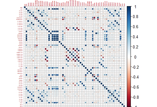
This plot is easier to check than the whole correlation matrix in numbers.
Now we can isolate areas of this matrix, like the one which shows higher correlation between the variables:
corrplot(M[14:20,14:20],tl.cex = 0.8

Suscribirse a:
Comentarios (Atom)