First I would like to wish to the readers of this blog all the best along this 2019.
Recently it has been my birthday and I receive as present the book "Applied Predictive Modelling" wrote by Max Kuhn and Kjell Johnson. It is really a great book for those who like R for predictive modelling and to get more knowledge about the Multivariate Analysis. Sure a lot of post will come inspired by this book along this year.
I remember when I started with R in this blog I post plots of the correlation matrix to show how the wavelengths in a near infrared spectrum are correlated and why for that reason we have to use techniques like PCA to create uncorrelated predictors.
In R there is a package called like the book "Applied Predictive Modelling", where we can find the "Cell Segmentation Data", which Max Kuhn use quite often on his webinars (you can find them available in YouTube).
These Cell Segmentation Data has 61 predictors, and we want to see the correlation between them, so with some code we isolate the training data and use only the numeric values of the predictors to calculate the correlation matrix:
library(caret)
library(AppliedPredictiveModeling)
library(corrplot)
data(segmentationData) # Load the segmentation data set
trainIndex <- createDataPartition(segmentationData$Case,p=.5,list=FALSE)
trainData <- segmentationData[trainIndex,]
testData <- segmentationData[-trainIndex,]
trainX <-trainData[,4:61] # only numeric values
M<-cor(trainX)
corrplot(M,tl.cex = 0.3)
This way we get a nice correlation plot:
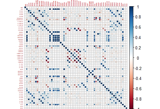
This plot is easier to check than the whole correlation matrix in numbers.
Now we can isolate areas of this matrix, like the one which shows higher correlation between the variables:
corrplot(M[14:20,14:20],tl.cex = 0.8

No hay comentarios:
Publicar un comentario