Mostrando entradas con la etiqueta Distancia Mahalanobis. Mostrar todas las entradas

21 feb 2022

To consider for the Mahalanobis distance calculation

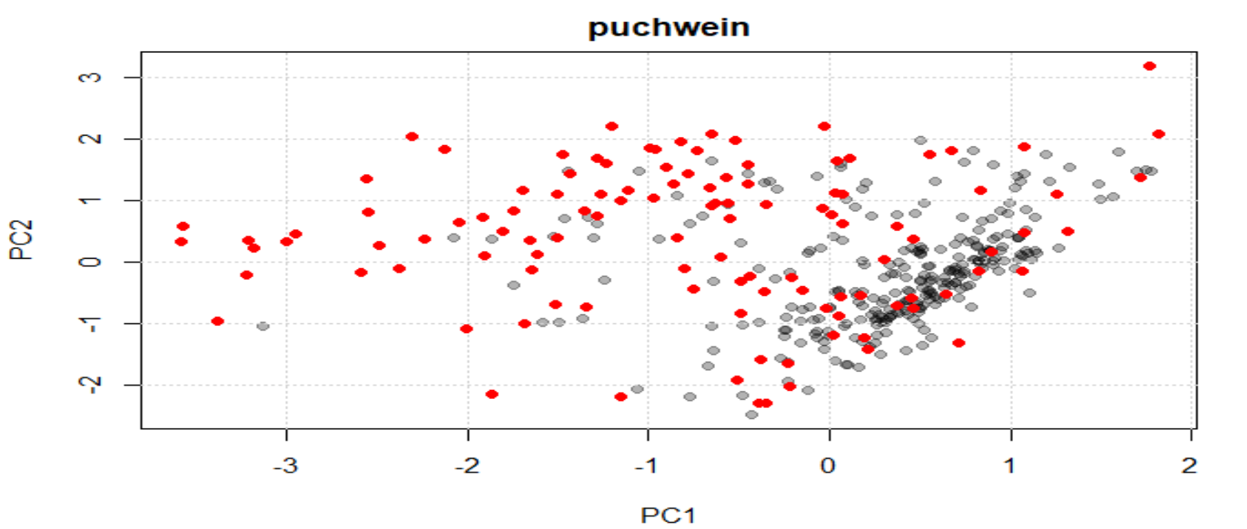
 As we saw in the post "Try to find high content gypsum samples (part 3)" , when we develop the principal component analysis as much variance as possible (we determine the explained variance limit) is explained, and unless we saw all the sores maps, we may have not a good idea about what is happening to our data.

The average spectrum represents all the groups, so we cannot expect that with the Mahalanobis distance all the samples with gypsum will be marked as outliers, because the average spectrum represents as well those samples. Only the ones with high and very high gypsum content can probably be marked as outliers by Mahalanobis distance. Now that we have make two samples sets ("gypsum content" and "non or low gypsum content"), we can check the sample sets separately to understand better our data.

Let´s check again the Mahalanobis distance plot once we have, by spectra visualization and discrimination by correlation, the two sample sets ("No" and "Yes" gypsum content):


See how some of the gypsum content samples are over 3 Mahalanobis cut-off (but not all).
Now that the "No" samples are in a new sample set, we can see their spectra:

There are some samples that seem outliers, but all the rest seem to group quite well together, anyway we wait to see the PC score maps:
Now we see different patterns.

Let´s see finally the new Mahalanobis distances:


22 may 2021

Working with Soilspec data (part 8)

We continue in this post with the "chemometrics" package used in the previous one. Indeed the ellipses here we see the cutoff and the samples which are bellow and over it. 

Apart from the graphics we can have a list with the sample number and the robust or classical Mahalanobis distances values.


Is it interesting to see the distribution of the Mahalanobis distances, and for that we can use the histograms:

hist(res$md)    (classical Mahalanobis distance)
hist(res$rd)    (robust distance)


Normally we see the classical histogram in the software we commonly use, due that they use the classical Mahalanobis distance.

Now it is time to reduce the database to take the structure of it, this way can serve to us to send the selected samples to the lab and to save money in the development of the calibration and at the same time keep the variability of the samples. There are several algorithms to do it with the “prospectr” package, being one of then the ShenkWest (nice to have this algorithm in R, and all that workm with Win ISI know it quite well), but I am going to use the “puchwein”, because it seems to me that it capture the structure quite well.

pu <- puchwein(X = PC_scores, k = 0.1, pc =5) 

plot(pu$pc[,c(1,2)], col = rgb(0, 0, 0, 0.3), 
     pch = 19, main = "puchwein")
grid()
points(pu$pc[pu$model,],col = "red", pch = 19) 


Now we can see the selected samples in the scores map PC1 vs PC2 in red color. These samples keep the structure quite well and can be used to send them to the lab.

15 mar 2020

Tidyverse and Chemometrics (part 16): Projecting a new season

We have developed the calibration for fish meal with Fish1+2 seasons (see previous post) and meanwhile we have new spectra for samples (47) from a new season (Fish3) that we acquire on the NIR instrument. These samples are processed by the model and give some results, and one of the questions could be: how accurate are those results?.

Send the 47 samples to the lab will be too costly, so we want to send a set of samples, which captures the structure of the new fish3 samples, and at the same time add new variability to the actual database. Doing this, the next time we create a new calibration it will be more representative for the fish meal population, hopping to get better accuracy for the fish4 set and so on.

The idea this time, is to make it in a manual way, projecting the samples and selecting a certain number based on the money we want to expend in laboratory analisis.

We have seen the calculation for the projections in a previous post, so we just draw the new season scores (in red) over the PC space of the previous seasons 1 and 2, showing the scores for fish1 and fish 2 in blue color.

#PC1 vs PC2
drawMahal2(fish_1d_all_pc$T[,c(1,2)],
          center=apply(fish_1d_all_pc$T[,c(1,2)],2,mean),
          covariance=cov(fish_1d_all_pc$T[,c(1,2)]),
          quantile=0.975,xlab="PC1",ylab="PC2",col="blue",
          main="Fish3 projected on Fish1+2 PCs")
par(new=TRUE)
drawMahal2(fish3_1d_T[,c(1,2)],
          center=apply(fish_1d_all_pc$T[,c(1,2)],2,mean),
          covariance=cov(fish_1d_all_pc$T[,c(1,2)]),
          quantile=0.975,xlab="PC1",ylab="PC2",col="red")


 We notice that many of the Fish3 samples are outside of the ellipse formed by Fish1 + Fish2 samples. We can check the other score maps:

The score maps show clearly that many of the samples are outliers.
We can calculate the Mahalanobis distance for every sample to check how many are outside the cutoff limits:

fish1y2_T_mean<-colMeans(fish_1d_all_pc$T)
fish3_d_mahal<-sqrt(mahalanobis(fish3_1d_T[,c(1:5)],

                    fish1y2_T_mean[c(1:5)],
                    cov(fish_1d_all_pc$T[,c(1:5)])))

     1F3      2F3      3F3      4F3      5F3      6F3 
1.808546 2.410371 1.817420 2.674472 3.882431 8.894017 
     7F3      8F3      9F3     10F3     11F3     12F3 
3.956726 4.129471 4.194344 4.608712 5.637123 4.561250 
    13F3     14F3     15F3     16F3     17F3     18F3 
5.020347 3.427444 3.330089 3.348741 4.039378 4.006860 
    19F3     20F3     21F3     22F3     23F3     24F3 
7.992560 8.237418 5.813657 5.672932 6.258595 5.949936 
    25F3     26F3     27F3     28F3     29F3     30F3 
5.763188 6.121845 7.013205 6.370521 6.109572 3.944506 
    31F3     32F3     33F3     34F3     35F3     36F3 
2.576640 2.675160 3.993163 6.187790 7.092179 7.118996 
    37F3     38F3     39F3     40F3     41F3     42F3 
3.460574 4.061820 4.202667 2.000492 1.806180 3.880191 
    43F3     44F3     45F3     46F3     47F3 
3.871592 4.937029 3.415351 4.433763 8.009396 

Without any doubt there are samples in these sample will expand the database but we have to capture the structure of this variability, removing samples that could be neighbours.

We proceed with this option in the next post. 

7 feb 2020

Tidyverse and Chemometrics (part 11): Removing redundant samples

We have seen in the last post, how the fish2 spectra was projected on the principal component space designed by the fish1 spectra. We saw clearly than some of the fish2 samples were out of the ellipse and others were in, but not very close to the fish1 samples. At the same time, some samples of fish2 are neighnors between them or some probably are neighbors of fish1 samples.
We can measure the distance from one sample to another by the Mahalanobis distance. We use to call this distance “Mahalanobis Neighborhood Distance”, and depending of the threshold we use around each sample, more or less samples are selected as neighbors.
The first I want to do is to remove neighbors in fish2, in order to select a percentage (50% approx.) of the fish2 samples to send to the lab for reference analysis. With this intention, I use the function “puchwein” from “prospecr” package and I note the selected samples to make a “fish2_selected” file. In this case, “puchwain” creates a new PC space with the fish2 samples and measure the distance between their scores. With this configuration the selection are 21 samples, so 19 are redundant.
 
pchw_fish2<-puchwein(nir_fish2_2d,pc=0.95,k=0.2,
                     min.sel=20,details=TRUE,
                     .center = TRUE,.scale = FALSE)
Now we have to check if the selected samples have neighbours into the samples of fish1, so we use fDiss from prospect to compare the distances between the scores of fish1 and the scores we got with the projections of the 21 selected samples on the PC space of fish1. If we set a threshold of 0.2 we see that four of the selected samples have neighbors on fish 1 (positions 5, 13, 19 and 20), so we remove them from the selected set, so finally we have 19 samples to send to the laboratory.
 
summary(fDiss(Xr=nir2d_pc$T[,1:5],
             X2=fish2_2d_T_sel1[,1:5],
             method = "mahalanobis",
             center = TRUE, scaled = FALSE))
neig_f2f1<-fish2_2d_T_sel1[c(5,13,19,20),]
fish2_2d_T_sel2<-fish2_2d_T_sel1[-c(5,13,19,20),]
Once we have done it, we can overplot again all the samples:
  • Fish1 samples in blue.
  • Fish2 redundant samples in red.
  • Fish2 selected samples in green
  • Fish2 neighbors of Fish1 in orange.


Now we wait for the laboratory values, ….,see you in the next post.

25 jun 2019

More about Mahalanobis distance in R

There are several Mahalanobis distance post in this blog, and this post show a new way to find outliers with a library in R called "mvoutlier".
 
Mahalanobis ellipses can only be shown in 2 dimensions with a cutoff value as we have seen, so we show the maps of scores 2 by 2 for the different combinations of PCs, like in this case for PC1 and PC2 and we can mark the outliers in the plot by the identify function: 


In this case I mark some of the samples out of the Mahalanobis distance cutoff. Anyway the Mahalanobis distance is univariate and in this case where we have a certain number of PCs, we have to see not just a map of two of them or all at the same time, we need a unique Mahalanobis distance value and to check if that value is over or into the cutoff value that we assign.
 
For that reason we use the Moutlier function of the "chemometrics" package and show a real Mahalanobis outlier plot which can be Robust or Classical:
 
We can see the classical plot and identify the samples over the cutoff:
 
We can see the list of all the distances in the output list for the function. I will continue with more options to check the Mahalanobis distances in the next post.

12 mar 2019

Over-plotting validation and training data in the Mahalanobis ellipses

One of the great things of R is that we can get the code of the different functions (in this case the function "drawMahal" from the package "Chemometrics" ) and adapt this code to our necessities.
 
I wanted to over-plot the training set scores for the first and second principal components with the scores of the validation set, which are redundant samples taken apart in a selection process with the function "puchwain" from the package "prospectr", but I get problems with the scale due to the way "drawMahal" fix the X and Y limits. But editing the function we can create a personalize function for our case and to compare the redundant samples in red with the training samples in black.
 
Now the next is to over-plot the test samples (in theory bad samples) in another color in a coming post.
 

17 abr 2018

Covariance plot and Mahalanobis ellipse

In the previous post we have seen  the correlation plot and in this one the covariance plot  matrix, we just have to change the function "cor" for "cov" in the code.
 
Covariance  matrix is used frequently in chemometrics, like in this case to define the ellipse for the Mahalanobis distance using the covariance between the two axes (one for the 964 wavelength and the other the linear combination of wavelengths 1022 and 902 that we have seen in other recent post.
 
We can do this easily with the package chemometrics and this code:

x3_x1x2<-cbind(x3,x1x2)
library(chemometrics)
drawMahal(x3_x1x2,center=apply(x3_x1x2,2,mean),
          covariance=cov(x3_x1x2),

          quantile=0.975,col="blue")

to get this plot:

25 feb 2018

PCR vs. PLS (Part 8)

Trying to understand better the data set of meat meal, I gave the blue color to the samples from 0 to 10%, green to samples which has from 10% to 20%, orange color to samples from 20 to 30% and red to samples from 30 to 40%.
If we develop the PCA and apply the Mahalanobis Distance to different planes we get:

We can continue with the rest of combinations, trying to see which one gives the best  correlation or in this case the better pattern with the colors.
Developing the PCR Regression, we get the explained variance plot which can help us to see which PC has the highest correlation with the Ash constituent:
It is clear than 6th PC has the highest explanation for Ash, so let´s see the plane:
 
Ash is not an easy parameter to calibrate, and a high number of components are necessary for a calibration, but this one has the highest contribution in a PC regression in this case. Here are outliers that are not remove yet, but as soon they be removed, the correlation will improve a little bit.
 
> cor(NIR_princomp$scores[1:1280,6],Ash[1:1280,])
[1] 0.5487329
 
Really it is a high correlation for this parameter.


20 may 2015

MD Looking to the subsamples statistics


Normally when scanning ungrounded samples like wheat, barley, corn in a NIR instrument, we use a large cup which moves across the sample presentation plate, in some cases continuously and in others stopping and scanning several times. Finally we get the average results, but there are some software’s which give you also the subsample results, giving information of the standard deviation between subsamples which is a good indicator for homogeneity or other issues. It can give you also the Mahalanobis distance for each subsample.

Suppose the case of a large cup where we acquire 32 scans. The cup stop in 8 different positions to scan the sample, so we have 8 subsamples with 4 scans each. Lower numbers of scans mean a noisier spectrum, so the Mahalanobis distance will be normally higher in all the subsamples (independently) than the Mahalanobis distance of the 32 scans average spectrum.

We have build our score matrix with 32 subscans average spectra, so if we compre spectra of 4 subscans average spectra it is normal we get out of range MD values.