28 feb 2018
26 feb 2018
PCR vs. PLS (part 9)
One way to understand the high correlation for the 6th term vs. Ash parameter is to check the 6th term. Terms are spectra which reconstruct the original spectra and are included in the P matrix.
The original spectra is treated with first derivative where the peak maximum is converted to a zero crossing, so it is difficult to understand easily what it is going on. So we have to find to which wavelengths correspond the zero crossings.
We can check in the loading vector in which wavelengths the values goes from negative to positive or from positive to negative or to use the identify function in R like in this case to find the data points for the zero crossings and to check after to which wavelengths correspond those data points.

identify(wavelength,NIR_princomp$loadings[,6])
[1]    39    80    85    113   132   145   148
nm 1176 1258 1268 1324 1362 1388 1394
182 193 200 214 217
nm 1462 1484 1498 1556 153
Cellulose
In this case 1484 and 1498 are normally bands assigned to cellulose.
The original spectra treated with the first derivative is:

Remember from the previous post that the ash content is 0 to 10 for blue spectra, 10 to 20 for green, 20 to 30 for orange and 30 to 40 for red, grey for samples with no ash reference value.
In this set we have mix meat meal, pork, poultry,...
25 feb 2018
PCR vs. PLS (Part 8)
Trying to understand better the data set of meat meal, I gave the blue color to the samples from 0 to 10%, green to samples which has from 10% to 20%, orange color to samples from 20 to 30% and red to samples from 30 to 40%.
If we develop the PCA and apply the Mahalanobis Distance to different planes we get:


We can continue with the rest of combinations, trying to see which one gives the best correlation or in this case the better pattern with the colors.
Developing the PCR Regression, we get the explained variance plot which can help us to see which PC has the highest correlation with the Ash constituent:

It is clear than 6th PC has the highest explanation for Ash, so let´s see the plane:

Ash is not an easy parameter to calibrate, and a high number of components are necessary for a calibration, but this one has the highest contribution in a PC regression in this case. Here are outliers that are not remove yet, but as soon they be removed, the correlation will improve a little bit.
> cor(NIR_princomp$scores[1:1280,6],Ash[1:1280,])
[1] 0.5487329
Really it is a high correlation for this parameter.
21 feb 2018
Análisis de la adulteración leche en polvo por NIR
No existe demasiada documentación sobre los métodos discriminantes de Win ISI 4, por lo que trataré de poner la que vaya encontrando para que podáis acceder a ella desde el blog. En este caso se emplean los nuevos métodos para detectar adulteraciones de la melanina en leche en polvo y os lo podéis descargar desde este enlace.
20 feb 2018
PCR vs. PLS (part 7)
We have used PLS with tis data set in the posts series "Analyzing Soy Meal in transmittance", so I just want to add in these coming posts a comparison between the regresiones developed in PLS and in PCR.
The best way to do it is comparing some plots and in this post I show the comparison of the PCR and PLS regression with the same number of terms and with the same calibration set (odd samples), and the same validation during the development of the model (Cross Validation).
The plot shows how (as expected), the first terms are more correlated for the constituent of interest (protein in this case) for the PLS terms than for the PCR, so the RMS are better, but as soon as more terms are added are almost the same (a little bit better for the PLS).
## add extra space to right margin of plot within frame
par(mar=c(5, 4, 4, 6) + 0.1)
plot(Xodd_pcr3,"validation",estimate="CV",ylim=c(0.5,2.0),
par(mar=c(5, 4, 4, 6) + 0.1)
plot(Xodd_pcr3,"validation",estimate="CV",ylim=c(0.5,2.0),
xlim=c(1,10),col="blue",lwd=2,
main=" Corr & RMSEP PCR vs PLS")
par(new=TRUE)
plot(Xodd_pls3,"validation", estimate="CV",
main=" Corr & RMSEP PCR vs PLS")
par(new=TRUE)
plot(Xodd_pls3,"validation", estimate="CV",
ylim=c(0.5,2.0),xlim=c(1,10),col="red",lwd=2,
main="")
## Plot the second plot and put axis scale on right
par(new=TRUE)
plot(terms,Xodd_pls3_cor, xlab="", ylab="", ylim=c(0,1),
axes=FALSE, type="l",lty=4,lwd=2, col="red")
par(new=TRUE)
plot(terms,Xodd_pcr3_cor, xlab="", ylab="", ylim=c(0,1),
axes=FALSE,type="l",lty=4,lwd=2, col="blue")
## a little farther out (line=4) to make room for labels
mtext("Correlation",side=4,col="black",line=3)
axis(4, ylim=c(0,1), col="black",col.axis="black",las=1)
legend("bottomright",legend=c("RMSEP PLS", "RMSEP PCR",
"Corr PLS","Corr PCR"),
col=c("red","blue","red","blue"),
col=c("red","blue","red","blue"),
lty=c(1,1,4,4),lwd=2)

A reason for the improvement in the PLS can be seen in the regression coefficients (with 5 terms), where the PLS (in red), are more sharp, and can give better estimations ( we try to analyze this in coming posts)

18 feb 2018
PCR vs. PLS (Part 6)
After checking the RMSEP and correlation with different terms in the PCR I get this plot:
 using this code:
par(mar=c(5, 4, 4, 6) + 0.1)
plot(Xodd_pcr3,"validation",estimate="CV",
col="blue",ylim=c(0.5,2.5),
xlim=c(1,10),lwd=2,xlab="",ylab="",main="")
par(new=TRUE)
plot(terms,Test_rms,type="l",col="red",ylim=c(0.5,2.5),
xlim=c(1,10),lwd=2,xlab="Nº Terms",
ylab="RMSEP",
main=("CV vs Ext Validation & Corr"))
## Plot the second plot and put axis scale on right
par(new=TRUE)
plot(terms, Test_corr, pch=15, xlab="", ylab="",
ylim=c(0,1),axes=FALSE, type="b", col="green")
## a little farther out (line=4) to make room for labels
mtext("Correlation",side=4,col="green",line=3)
axis(4, ylim=c(0,1), col="green",
col.axis="green",las=1)
legend("topright",legend=c("CV", "Ext Val","Corr"),
col=c(1:3),lwd=2)
## In the plot 5 seems to be the best option
for the number of terms
Now we can compare the results in the XY plot, as we saw in the post "PCR vs. PLS (part 5)" to get the conclusions.
 The statistics for this external validation set with 5 terms are (Monitor function):

par(mar=c(5, 4, 4, 6) + 0.1)
plot(Xodd_pcr3,"validation",estimate="CV",
col="blue",ylim=c(0.5,2.5),
xlim=c(1,10),lwd=2,xlab="",ylab="",main="")
par(new=TRUE)
plot(terms,Test_rms,type="l",col="red",ylim=c(0.5,2.5),
xlim=c(1,10),lwd=2,xlab="Nº Terms",
ylab="RMSEP",
main=("CV vs Ext Validation & Corr"))
## Plot the second plot and put axis scale on right
par(new=TRUE)
plot(terms, Test_corr, pch=15, xlab="", ylab="",
ylim=c(0,1),axes=FALSE, type="b", col="green")
## a little farther out (line=4) to make room for labels
mtext("Correlation",side=4,col="green",line=3)
axis(4, ylim=c(0,1), col="green",
col.axis="green",las=1)
legend("topright",legend=c("CV", "Ext Val","Corr"),
col=c(1:3),lwd=2)
## In the plot 5 seems to be the best option
for the number of terms

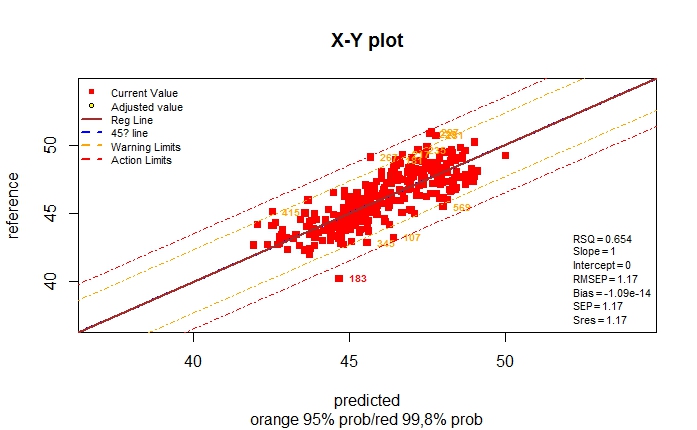
> monitor10c24xyplot(pred_vs_ref_test_5t)
Validation Samples  = 25
Reference Mean  = 45.6236
Predicted Mean  = 46.38495
RMSEP    : 1.046828
Bias     : -0.761354
SEP      : 0.7332779
Corr     : 0.9131366
RSQ      : 0.8338185
Slope    : 0.7805282
Intercept: 9.418837
RER      : 8.115895   Poor
RPD      : 2.428305   Fair
Residual Std Dev is : 0.633808
    ***Slope/Intercept adjustment is recommended***
BCL(+/-): 0.3020428
***Bias adjustment in not necessary***
Without any adjustment and using  SEP as std dev
the residual distibution is:
Residuals into 68% prob (+/- 1SEP) = 15 % = 60
Residuals into 95% prob (+/- 2SEP) = 21 % = 84
Residuals into 99.5% prob (+/- 3SEP) = 23 % = 92
Residuals outside 99.5% prob (+/- 3SEP) = 2 % = 8
With S/I correction and using Sres as standard deviation,
the Residual Distribution would be:
Residuals into 68% prob (+/- 1Sres) = 20 % = 80
Residuals into 95% prob (+/- 2Sres) = 24 % = 96
Residuals into 99.5% prob (+/- 3Sres) = 25 % = 100
Residuals outside 99.5% prob (> 3Sres) = 0 % = 0
17 feb 2018
PCR vs. PLS (part 5)
It´s time for an external validation with an independent test. Samples in the calibration are from soy meal scanned in a NIT instrument (850 to 1050 nm), but there was some years without testing the calibration with new samples so I have the ocasión to scan new samples in a new instrument (from a new generation). Of course the path-length for transmission must be configure to the same value and the sample must be representative.
The validation set has 25 samples were we try to find the wider range as possible. The reference values comes principally from two laboratories, but there are two samples from a different laboratory.
we develop in the lasts posts a PCR calibration where we saw that with 10 terms we obtained the better results, but maybe this value is high in order to make the calibration more transferable. The test validation will help us to check this.
If we don´t consider the Lab origin, and we over-plot the results of predictions over the XY calibration (including cross validation predictions), we get this plot:
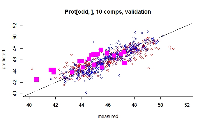
There are some samples that fit quite well, others have a Bias, and other random error. So we want to understand better what is going on, so we can give a color depending of the lab which gives the reference value.
ylim=c(40,52),cex=2,pch=21,
bg=(Lab_test),col=Lab_test,lwd=4,xlab="",ylab="")
plot(pred_pcr_test,Prot_test,xlim=c(40,52),
ylim=c(40,52),cex=2,pch=21,
bg=(Lab_test),col=Lab_test,lwd=4,xlab="",ylab="")
legend("topleft",legend=c("Lab1", "Lab2","Lab3"),
cex=1.5,pch=19,
col=c(1:3))
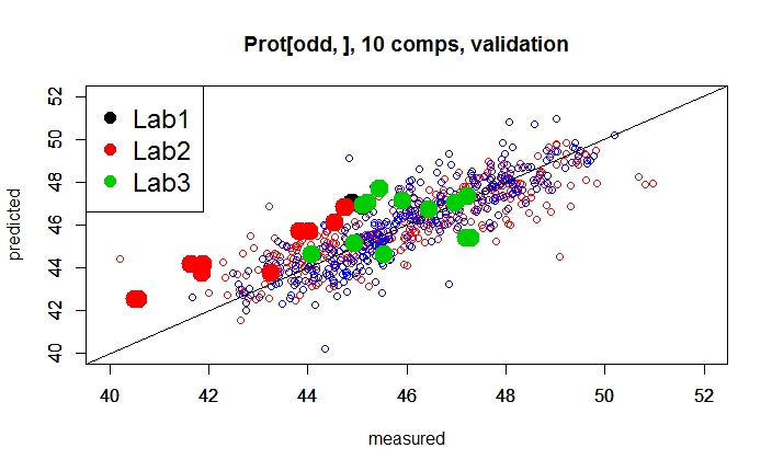
Well, we can take some conclusions from this plot, but we need to check the predictions with different number of terms to see if the Estándar Error of Prediction (with 10 terms the RMSEP is 1,65) decrease and the RSQ (with 10 terms 0,593) increase.

16 feb 2018
PCR vs. PLS (part 4)
In the post "Splitting spectral data into training and test sets" , we kept apart the even samples for a validation, so it is the time after the calculations in post (PCR vs PLS part 3) to see if the performance of the model, with this even validation sample set, is satisfactory.
First we can over-plot the predictions over the plot of the blue and red samples we saw in post (PCR vs PLS part 3), and the first impression is that they fit quite well, so the performance seems to be as expected during the development of the model.
plot(Xodd_pcr3.evenpred,Prot[even,],col="green",
bg=3,pch=23,xlim=c(40,52),ylim=c(40,52),
xlab="",ylab="")
legend("topleft",legend=c("Odd", "Odd CV","Even"),
col=c("blue","red","green"),pch=c(1,1,18),
cex=0.8,bg=)
abline(0,1)

RMSEP(Xodd_pcr3,ncomp=10,newdata=soy_ift_even$X_msc,
intercept=FALSE)
[1] 0.9616
Probably this "even" sample set is not really an independent set, so we need to go a step farther and check the model with a really independent set with samples taken in a different instrument, with reference values from different laboratories,.....This will be the argument of the next part in these series about PCR and PLS regressions.
15 feb 2018
PCR vs. PLS (part 3)
A common way to develop the regressions with PCR or PLS is with "Cross Validation", where we divide the training data set into groups that you can select depending of the number of samples: In the case you have few samples you can select a high (10 for example) value and in the case you have a lot of samples, you can select a low value (for example 4). One group is keep out and the regression is developed with all the others. We use the group keep outside to validate repeating the process as many times as validation groups.
So Iin the case of 4 groups), we obtain 4 validation statistic values as RMSEP, RSQ, Bias,... for every group we use in the development of the regression, so we can see from which term the RMSEP start to become higher, or the RMSEP values are almost flat and make not sense to add more terms to the regression.
Really the cross validation help us to avoid over-fitting, but it helps also to detect outliers (good or bad outliers we can say).
It is interesting that the samples in the training set have a certain way of sorting or randomnes . We don´t want that there are similar samples in the training and validation set, but this require inspection of the spectra previous to the development of the regression looking for neighbors, or other sources of redundancy. In the case there are similar samples we want that they stay if possible in the same group.
In the development of the PCR, we van select the Cross Validation option and also the number of segments or groups for validation, in this case 10:
Xodd_pcr3<-pcr(Prot[odd,] ~ X_msc[odd,],validation="CV",
segments=10,ncomp=30)
plot(Xodd_pcr3,"validation",estimate="CV")

If we see the plot of the RMSEP for the 30 terms, we see that the in the fourth the RMSEP decrease dramatically, but after 10 it does make not sense to use those terms, so we have to select 10 or less.
An external validation (if possible with more independent samples) can help us with the decision.
A particular case of Cross Validation is the Leave One Out validation, where a sample unique sample is keep out for validation and the rest stay for the calibration. The process is repeated until all the samples have been part of the validation process. So in this case there are the same numbers of segments or groups than number of samples. This process is quite interesting when we have few samples in the training set.
About the X-Y plots (Predicted vs Reference values), it is important to interpret them in the case of cross validation. There are plots which show the predicted values vs the reference values when all the samples are part of the regression (blue dots) and those plots are not realistic, so it is better to see the plot, when every dot (sample), has a value when it is not part of the model because it is in the validation set (red dots), this way we have a better idea of the performance of the regression for future samples.
plot(Xodd_pcr3,"validation",estimate="CV")
plot(Xodd_pcr3,"prediction",ncomp=10,col="red",
xlim=c(40,52),ylim=c(40,52))
Xodd_pcr3.pred<-predict(Xodd_pcr3,ncomp=10,
plot(Xodd_pcr3,"prediction",ncomp=10,col="red",
xlim=c(40,52),ylim=c(40,52))
Xodd_pcr3.pred<-predict(Xodd_pcr3,ncomp=10,
newdata=X_msc[odd,],
xlab="Predicted",ylab="Reference")
par(new=TRUE)
plot(Xodd_pcr3.pred,Prot[odd,],col="blue",
xlim=c(40,52),ylim=c(40,52),
xlab="",ylab="")
abline(0,1)
xlab="Predicted",ylab="Reference")
par(new=TRUE)
plot(Xodd_pcr3.pred,Prot[odd,],col="blue",
xlim=c(40,52),ylim=c(40,52),
xlab="",ylab="")
abline(0,1)

This is not a nice tutorial set where the samples fit well, but it is what you often fine in several applications where you want to try to get the best model for a certain product parameter and instrument.

eRum 2018 (European R users meeting)

Follow @erum2018
12 feb 2018
To consider when validating with LOCAL
I talk in other posts about LOCAL calibration. Once the LOCAL model is placed for routine, and the time pass, is time for validation.
LOCAL may have several products merged in a unique database from which we have developed the calibration, so it is important to label every sample in the validation set with a value (in this case 1: Black, 2:Red and 3:Green) corresponding to 3 different types of pork meat meal.
The validation is just to compare the reference values from the laboratory and the predicted values from our Near Infrared Instrument in this case, and the best way to represent it is a XY plot. The constituents most important in meat meal are: Moisture, Protein, Fat and Ash.
A first look to the general XY plots will gives an idea how it works:
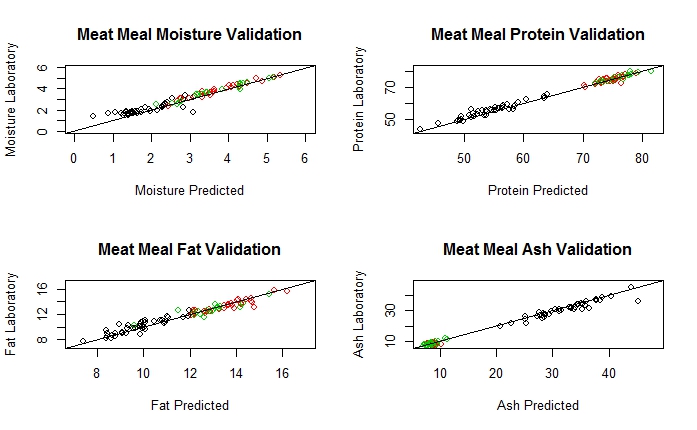
In the case of Protein we will get this validation:
For the Green product:


As we can see we have a significant Bias for product 1, but not for the other two products, so we can proceed with the validation adjustments (3 products linked to a LOCAL database, and one of them bias adjusted until the calibration is updated).
Plots with R

11 feb 2018
PCR vs. PLS (part 2)
Continue from post: "PCR vs PLS (part 1)":
As we add more terms to the model (PCR or PLS) the Standard Error of Calibration decrease and decrease, for this reason is necessary to have a validation method to decide how many terms to keep.
As we add more terms to the model (PCR or PLS) the Standard Error of Calibration decrease and decrease, for this reason is necessary to have a validation method to decide how many terms to keep.
Cross Validation, or an External Validation set are some of the options to use.
The "PLS" R package has the function "RMSEP" which give us the standard error of the calibration, and we can have an idea of which terms are important for the calibration.
Continuing with the post PCR vs PLS (part 1), one we have the model we can check the Standard Error of Calibration with the 5 terms used in the model.
RMSEP(Xodd_pcr, estimate="train")
(Intercept)      1 comps      2 comps      3 comps      4 comps      5 comps
      1.985        1.946        1.827        1.783        1.167        1.120
As we can see the error decrease all time, so we can be tempted to use 5 or even more terms in the model.
One of the values of the pcr function is "fitted.values" which is an array with the predictions depending of the number of terms.
As we can see in the RMSEP values, 4 seems to be a good number to choose, because there is a big jump in the RMSEP from R PC term 3 to PC term 4 (1.783 to 1.167), so we can keep the predicted values with this number of terms and compare it with the reference values to calculate other statistics.
Anyway these statistics must be considered as optimistic and we have to wait for the validation statistics (50% of the samples in the even position taken apart in the post "Splitting Samples into a Calibration and a Validation sets" .
Statistics with the Odd samples (the ones used to develop the calibration)
pred_pcr_tr<-Xodd_pcr2$fitted.values[,,4]
##The reference values are:
ref_pcr_tr<-Prot[odd,]
## We create a table with the sample number,
## reference and predicted values
pred_vs_ref_tr<-cbind(Sample[odd,],ref_pcr_tr,pred_pcr_tr)
Now using the Monitor function I have developed:
monitor10c24xyplot(pred_vs_ref_tr)
We can see other statistics as the RSQ ,Bias,...,etc.
Now we make the evaluation with the "Even" samples taken apart for the validation:
library(pls)pred_pcr_val<-as.numeric(predict(Xodd_pcr2,ncomp=4,newdata=X_msc_val))
pred_pcr_val<-round(pred_pcr_val,2)
pred_vs_ref_val<-data.frame(Sample=I(Sample[even]),
Reference=I(Prot_val),
Prediction=I(pred_pcr_val))
pred_vs_ref_val[is.na(pred_vs_ref_val)] <- 0
#change NA by 0 for Monitor function

As we can see in this case the RMSEP is a Validation statistic, so it can be considered as the Standard Error of Validation, and its value it´s almost the same as the RMSEP for Calibration.
RMSEP Calibration .........1,17
RMSEP for Validation .....1,13
10 feb 2018
PCR vs PLS (part 1)
The calculation of the Principal Component Regression coefficients can be obtained by the Singular Value Decomposition of the X math treated matrix, where we obtain the scores of the samples, multiplying the "u" and "d" matrices (u %*% d is what we call often the T matrix), and after, we make a regression of the constituent (Y matrix) vs. the scores (used as independent variables) to obtain the regression coefficients of the scores.
After we multiply the regression coefficients of the scores by the loadings "v" (P transposed matrix) to obtain the regression coefficients of the principal components regression.
This is the long way to do a PCR, but the quicker option is to use the "pcr" function from the R "pls" package.
## The short way:
library(pls)
Xodd_pcr2<-pcr(Prot[odd,] ~ X_msc[odd,],ncomp=5)
matplot(wavelengths,Xodd_pcr2$coefficients[,,5],
lty=1,pch=NULL,type="l",col="red",
xlab="Wavelengths",
ylab="Regression Coefficients")
## The short way:
library(pls)
Xodd_pcr2<-pcr(Prot[odd,] ~ X_msc[odd,],ncomp=5)
matplot(wavelengths,Xodd_pcr2$coefficients[,,5],
lty=1,pch=NULL,type="l",col="red",
xlab="Wavelengths",
ylab="Regression Coefficients")

We can look to the summary:
summary(Xodd_pcr2)
Data:  X dimension: 327 100
 Y dimension: 327 1
Fit method: svdpc
Number of components considered: 5
TRAINING: % variance explained
             1 comps  2 comps  3 comps  4 comps  5 comps
X             99.516    99.87    99.97    99.99    99.99
Prot[odd, ]    3.934    15.34    19.31    65.45    68.17
We have develop the PCR models with the half of the total database which we has split in two (odd and even) in the post "Splitting spectral data into training and test sets".
As we can see with just 1 PC component we explain more than 99,5% of the variance in X, but just a few of the Y variable (Protein in this case). We need to add more than just the first term (at least 4) to succeed in the calibration, but the cost is that we can add noise and over fit the model.
As we can see with just 1 PC component we explain more than 99,5% of the variance in X, but just a few of the Y variable (Protein in this case). We need to add more than just the first term (at least 4) to succeed in the calibration, but the cost is that we can add noise and over fit the model.
The external validation (even samples) set will help us to see the performance of the model.
9 feb 2018
Splitting spectral data into training and test sets
It is common to split the spectral data into a validation or test set and a calibration or training set. This can be done in different ways (random, structurally,...), selecting different percentages for each.
This is a simple case and we are going to select 50% of the samples for the calibration or training and the rest (the other 50%) for validation or test. This way we have a Training Set and a Validation test.
One simple way to proceed is to sort the samples randomly or structurally (sort by constituent value, date of acquisition, type of product,....), and select the odd samples for the Training Set and the even samples for the Test Set.
## DIVIDE DATA SETS INTO CALIBRATION AND VALIDATION SETS
##We create a sequence with the odd samples
odd<-seq(1,nrow(X_msc),by=2)
##We create a sequence with the even samples
even<-seq(2,nrow(X_msc),by=2)
#We take the odd samples for the training set
X_msc_tr<-X_msc[odd,]
Prot_tr<-Prot[odd,]
#We take the even samples for the validation set
X_msc_val<-X_msc[even,]
Prot_val<-Prot[even,]
matplot(wavelengths,t(X_msc_tr),type="l",xlab="wavelengths",
ylab="Absorbance",col="blue")
par(new=TRUE)
matplot(wavelengths,t(X_msc_val),lty=1,
pch=NULL,axes=FALSE,
type="l",col="red",xlab="",ylab="")

We can see in the plot the training spectra in blue and the test spectra in red. We will continue practicing with these sets in the next posts.
8 feb 2018
Building a neural network from scratch in R

Working with NIR data from many different sources is not easy and we have to check the data, make some groupings and to create different products in order to take certain ranges, eliminate bias and curvature, check for different math treatments to see which one makes the model more linear, etc.
Neural Networks Models deal with all these but is more complex and unknown. It requires also for a lot of data.
But how it works?: Read this link to know how it works and how can you build these models with R.


6 feb 2018
Using R to prevent food poisoning in Chicago
Amazing to see the applications of R, in this case for food safety, see the next video to see how it is applied:
You can see more details in the post from Revolutions blog:
This is a talk of the author of the R package used for this application


5 feb 2018
Help of category variables to understand the spectral population
When we work with a data set, it is important to know all the information we can compile about it, so we can create category variables in order to understand better the sample population. In the soy meal data set, I know that some of them come from Brazil, others from USA and the rest... I don´t know where they can from (probably from the same countries, but the samples were not labeled when acquired). So I created a category variable called "Origin" with a group 1 (from Brazil), a group 2 (from USA) and a group 3 (origin unknown).
In "R", 1 correspond to black color, 2 to red and 3 to green. We can plot the Mahalanobis distance ellipse in PC1 and PC2 and to see how the samples are grouped.
covariance=cov(T_msc),quantile=0.975,
col=soy_ift_conv$Origin,
xlab="PC1",ylab="PC2")
legend("topleft",legend=c("Brazil", "USA","Unknown"),
col=c("1","2","3"),pch=1, cex=0.8,
title="Origin")

It´s a pity not to have all the information about the green samples. Anyway consider also another types of categories variables, for example order the samples by the constituent value and add a category for high, medium and low protein.

4 feb 2018
Subtracting spectra to understand band positions
In this exercise (with the soy meal data in transmittance), we sort the soy meal spectra in four data-frames, by protein, moisture, fat and fiber, so in the first row we have the spectrum absorbance of the sample with the minimum value of protein, moisture, fat and fiber, and in the last one the sample with the maximum.
After, we subtract the spectra of the maximum and minimum to get the difference spectrum. Sometimes ,this spectrum difference help us to understand where are the main bands for the main constituents.
In this case is not easy due that we are working in a zone where the bands are very wide (second and third overtones), and the math treatment does not remove that overlapping (MSC). Anyway we can see some curiosities.


We have to take into account that we still have the interferences of the moisture (as example) over the other bands due that the high range (when the spectra is sorted) is for the constituent sorted, but there are range for the other constituents. Anyway seems to be more or less clear where are the absorbance bands in this NIT zone for protein and moisture.
As a curiosity, see how the Fiber difference spectrum is the opposite than the Protein difference spectrum due to the negative correlation between these two constituents for the soy meal.
All the plots are outputs of "R" code.
2 feb 2018
Abstracts ready for Eleventh Winter Symposium on Chemometrics (WSC)
Abstracts for the presentations of the Eleventh Winter Symposium on Chemometrics (WSC) are ready to be consult on the WSC web page. A lot of readers of this blog are from Russia, and I would like to say thanks to all from here.

Std Dev vs. Mean Centered Spectrum
This is a plot which shows the mean centered spectra treated with Multiple Scatter Correction, and over plotted is the estándar deviation values of the mean centered values at each wavelength.
The idea is to create a plot with different scales and laves in the axes, and the result is quite nice with this code:
## Plotting the Standard Deviation Spectrum
X_msc_mc_sd<-as.matrix(apply(X_msc_mc,2,sd))
par(mar=c(5, 4, 4, 6))
matplot(wavelengths,t(X_msc_mc),type="l",col="grey",
xlab="",ylab="",axes=FALSE)
mtext("Absorbancia",side=4,col="grey",line=3)
axis(4,col="grey",col.axis="grey",las=1)
par(new=TRUE)
matplot(wavelengths,X_msc_mc_sd,lty=1,pch=NULL,axes=FALSE,
type="l",col="red",lwd=2,xlab="Wavelength",ylab="",
main= "Std Dev vs Mean centered spectra")
axis(2,col="red",col.axis="red",las=1)
mtext("Standard Deviation",col="red",side=2,line=3)
axis(1,col="black",col.axis="black",las=1)
box()

Practice with this example.
RStudio Tips and Tricks
If you use R there are videos and tutorials which can help you to improve your work, so I will add some of them in the blog, under the label VIDEO: R-Tutorials
1 feb 2018
Correlation between scores and PC / PLS terms
First PC
search to explain the maximum variability in the X matrix. Once extracted the
second PC explain the maximum variance remaining, and the process is repeated until
almost all the important variance is explained and the remaining variance is
the noise and we don´t want it to incorporate this variance into the model.
PC term 2 0.3445256
PC term 3 0.1647146
PC term 4 -0.6888083
Comp 2 0.4193727
Comp 3 0.5348858
Comp 4 0.4425912

Once we
have the terms, samples are projected over the several PC terms and every
sample has a score for every term. Therefore, we have a score matrix with “N”
samples (rows) and “A” components (columns).
This variance
can be due to different sources or mixture of sources.
In the
case of PLS we are looking for a compromise explaining the maximum possible
variance in X, at the same time that we explain a maximum variance in Y. We
have also a score matrix when developing the PLS algorithm and this scores have
more correlation with the constituent that the scores calculated with PC.
In the
case of the soy meal in the conveyor, we can calculate the correlation between
the scores for every of the four PC and
the protein:
> cor(scores_4t_pc[,1:4],soy_ift_prot1r1$Prot)
[,1]
PC term 1 -0.2105997PC term 2 0.3445256
PC term 3 0.1647146
PC term 4 -0.6888083
We can
do the same, but with the scores of the PLS regression:
> cor(Prot_plsr_r1$scores[,1:4],soy_ift_prot1r1$Prot)
[,1]
Comp 1 0.2129742Comp 2 0.4193727
Comp 3 0.5348858
Comp 4 0.4425912
As I can
see the correlations are higher for the PLS, but there are some curiosities
about the PC scores that we can try to check yin future posts.
Suscribirse a:
Comentarios (Atom)