# 1022nm datapoint 87 Protein or Oil
# 902nm datapoint 27 Cellulose
# 964nm datapoint 58 CH2 Oil
x1<-X_msc_mc[,c(87)]
x2<-X_msc_mc[,c(27)]
x3<-X_msc_mc[,c(58)]
We have the values for Protein for these spectra.
Protein <- Prot
Let´s see the wavelengths in the mean centered MSC treated spectra
matplot(wavelengths,t(X_msc_mc),type="l",
xlab="wavelengths",ylab="Absorbance")
abline(v=1022)
abline(v=902)
abline(v=964)

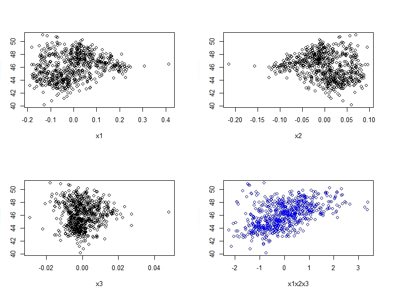
now see how the correlation becomes better in the case of the 4td plot where the X axis is a linear combination of the other 3 wavelengths
x1x2x3<-((139.98*x1)+(287.12*x2)+(121.02*x3))
par(mfrow=c(2,2))
plot(x1,Protein)
plot(x2,Protein)
plot(x3,Protein)
plot(x1x2x3,Protein,col="blue")
plot(x1,Protein)
plot(x2,Protein)
plot(x3,Protein)
plot(x1x2x3,Protein,col="blue")
We have worked with this data before with PLS and PCR and what we have done here is a MLR approach. An intercept value will place the date on the same scale.
No hay comentarios:
Publicar un comentario