28 ene 2020

Tidyverse and Chemometrics (part 10): Overlapping Calibration and New samples spectra

Once we have a starter calibration, we begin to analyze new samples and store their spectra. We keep the spectra and the sample correctly identified with the idea to send some of those new samples to the laboratory. This is the new situation where I have  scanned  40 new samples, so I have 40 new predictions.

We can have at this moment three questions:
  1. Are the predictions aceptable according to the statistics we have seen during the regression development?.
  2. Are the new samples represented by the samples we have in the calibration?
  3. Do these new samples, or part of them, give new variability to improve the calibration database and their statistics?.
 

We try to give a response to this questions on the next posts. For the first question and part of the third one, we need to send some samples or all to the laboratory. But questions two and third will help us to define which samples we will send to the laboratory in order to expand the calibration to perform better for future samples.
 
Now we can use R to have a visual inspection overlapping the spectra of samples in the calibration (blue color) and spectra of the new 40 samples in pink color, and we do it with four ways:
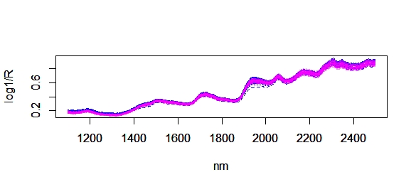
  1. Raw spectra.

  2. SNV and Detrend.

  3. SNV + DT + First Derivative

  4. SNV + Second Derivative.
    We can check the spectra and expand some areas  (areas specially related with fat, moisture or protein bands) to reply the three questions, but we will get better pictures when we project sample on the PC space, and calculate distances between them.

25 ene 2020

Comparing "R-PLS", "CARET" and "WIN ISI"

I made this exercise just for fun. When we develop a regression we don´t have to look the the XY plot where a sample is predicted from a model where this sample is already included, we have to compare it against a model where she is excluded. So we have to look to see how the samples fits to the regression line to the XY plot of Cross Validation for the number of terms we have selected for the final model.
 
In this case I develop the comparison for a regression of protein in fish meal with the 40 samples I am using in the series of tutorials about "Tidyverse and Chemometrics" using the PLS  and Caret packages and also Win ISI (FOSS Analytical Chemometric software).
 
PLS, Win ISI and Caret recommend 8 terms and as you can see they gave the same LOO Cross Validation XY plots or very similar. Remember that these are the XY plots of predictions where every sample is predicted with the 39 remaining so it´s more realistic of how it will performs in routine.


23 ene 2020

Tidyverse and Chemometrics (part 9)

The idea of these "tidyverse and chemometrics" tutorials is to create enough code to prepare a training about chemometrics with R and to follow the rules I commonly use when I develop a calibration with other chemometric softwares. In the previous post we have seen how we have 40 samples of fish meal and we want to use them to create a starter calibration with the idea to increase the number of samples in the future spending the less money as possible in laboratory data.

As the tutorials go through I will sometimes come back to previous steps if necessary, trying to find the best configuration as possible to the models math treatments and predictions.

In the previous model we developed the calibration with Caret, and this time we will do it with the PLS package, with the same math treatments SNV+DT+First Derivative.

So the code to create the new dataframe  we are goings to use is:

library(prospectr)
nir_snvdt<-detrend(nir,wavelength)


once the snv+dt is applied we apply the first derivative

nir_1d<-gapDer(nir_snv,m=1,w=1,s=4)

the first derivative truncate the spectra on the extremes, so the range change:

wavelength_1d<-seq(1108,2490,2)        #new range for the 1D
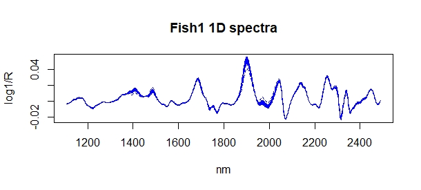
matplot(wavelength_1d,t(nir_1d),type="l",col="blue",
        xlab="nm",ylab = "log1/R",
        main="Fish1 1D spectra")


Sample ID and constituent values are the same whichever the math treatment is:
 
fish1_1d_df1<-data.frame(sample_id,month,year,dm,
                         protein,fat,ash,I(nir_1d),
                         stringsAsFactors = FALSE)
 
Now we can develop the PLS model using the Leave One Out Cross Validation option:
 
library(pls)
fish1_prot_plsr<-plsr(protein~nir_1d,data=fish1_1d_df1,
validation="LOO",ncomp=10)
 
Now we will create a first plot that will help us to take the decisión of how many terms to use for the model:
 
par(mfrow=c(1,2))
plot(fish1_prot_plsr,"validation", estimate="CV")
 
with the number of terms with the lowest RMSE (8), we create the XY plot for predicted vs reference values:
 
par(pty="s")
plot(fish1_prot_plsr,"prediction",ncomp=8)


 As you can see we get the same results than the regression win Catet in the previous post.


20 ene 2020

Tidyverse and Chemometrics (part 8)

Today time to develop a calibration with our first set of fishmeal data math treated with SNV + Second Derivative.
 
We have just 40 samples and one outlier in the PCA calculation using Mahalanobis distance (is an extreme sample for dry matter content), so I use all the samples in the training set this time, and I will have a look to the Cross Validation Error this time to select the terms I will use in the PLS model.
 
We will have soon an independent validation set and we will see how this model performs.
 
To develop the model for Protein, we use Caret this time, with the Leave One Out Cross Validation:

library(caret)
model_fish1_prot_pls <- train(protein~nir_1d,data=fish1_1d_df1,
                         method = "pls",scale=FALSE,
                         trControl =trainControl("LOOCV"),
                         tuneLength = 10)


Now let´s see how many PLS factors we need to develop our first model for protein.

library(tidyverse)
     model_fish1_pls %>%
           ggplot(aes(RMSEP))+
                  geom_point()


As we can see 8 PLS terms is the best option for the model, so we can keep it to see how it predict new future samples.

To see how the model performs lets see how every sample is predicted with all the remaining 39 in the calibration:
loocv_prot_8<-subset(model_fish1_prot_pls$pred,ncomp==8)
loocv_prot_8<-loocv_prot_8[,c(1,2)]
plot(loocv_prot_8$obs,loocv_prot_8$pred,

      main= "Caret PLS 8t")

It seems not to be a very nice fitted model, but it is our first starter calibration for protein in fish meal.

17 ene 2020

Tidyverse and Chemometrics (part 7)

This time practicing to to draw a spectra plot with "ggplot2" (part of the tidyverse package). I found some useful information on stackoverflow, but I have to adapt it to my data and try to understand the process. Finally the result is quite nice, but still a lot of things to learn about this complete package.

Some preparation of the dataframe is need first:

Unclass "nir" from "asis"  to a variable per wavelength:
FMraw <- cbind(fish1_df, as.data.frame(unclass(fish1_df$nir)))
We dont need "nir" so we make it NULL
FMraw$nir <- NULL

Now we pivot the dataframe using the wavelength columns as X and the absorbances values as Y, and for that we use the packages:
library(dplyr)
library(tidyr)   
FMraw_spec <- FMraw %>%

mutate(row = row_number()) %>%
gather(nm, value,-sample_id,-month,

       -year,-dm,-protein,-fat,-ash,-row)

Now we can plot the fishmeal spectra with ggplot2:
library(ggplot2)
ggplot(FMraw_spec, aes(x = nm, y = value)) +
    geom_line(color="red",linetype="dotted")+
              xlab("nm")+
              ylab("log 1/R")+
              ggtitle("Fish meal raw spectra")


And get the plot spectra result:

16 ene 2020

Tidyverse and Chemometrics (part 6)

In this post we are going to sort the fishmeal dataframe by one of the constituents: "fat". We will do it first by the classical way, using the function "order" and after with the tidyverse option.
The original dataframe is:

fish1_2d_df1<-data.frame(sample_id,month,
                         year,dm,protein,
                         fat,ash,I(nir_2d),
                         stringsAsFactors = FALSE)

When we proceed this way building the dataframe, "nir_2d" becomes an "as is" class, while the other objects of the dataframe are "numeric" or "characters". This is important when we want to plot the spectra with the function "matplot".

Now we sort it by the classical way, and we will give it another name (the default order is ascendant , the same for the tidyverse option):

fish1_2d_df1_fat<-fish1_2d_df1[order(fish1_2d_df1$fat),] 

if we do it by tidyverse (text code for tidyverse in brown):
 
library(tidyverse)
fish1_2d_df2_fat<-fish1_2d_df2 %>%
                  arrange(fat)


Now the I want to substract the sample with the lowest content in fat (position 1) from the sample with the highest content of fat (position 40). I am going to do it with the classical way but the idea is all along this year try to learn and show you how we can do it with ggplot2 which is one of the tidyverse packages.
As the spectra with second derivative is "asis", we need to convert it to a matrix:

nir2d_fat<-as.matrix(fish1_2d_df_fat$nir_2d)
matplot(wavelength_2d,t(nir2d_fat[c(1,40),]),

        type="l",col=c("red","blue"),
        xlab="nm",ylab = "log1/R",
        main="Samples with lowest/highest fat content")


This way we plot in same way the spectral range for fat:


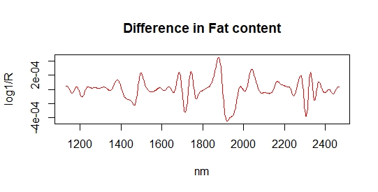
But let´s look better to the difference spectrum:

nir2d_fat_lowest<-nir2d_fat[1,]
nir2d_fat_highest<-nir2d_fat[40,]
diff_fat<-nir2d_fat_highest-nir2d_fat_lowest
matplot(wavelength_2d,diff_fat,type="l",col="red",
        xlab="nm",ylab = "log1/R",
        main="Difference high/low fat")


If we consult the bibliography the fat band for this type of product is a certain bands, so let´s draw some vertical lines at these wavelengths to see if it match with some bands of the difference  range spectrum for fat:

abline(v=1200)
abline(v=1720)
abline(v=1760)
abline(v=2310)
abline(v=2340)


We can see that the fat bands appear  in the difference spectrum.

11 ene 2020

Tidyverse & Chemometrics (part 4)

It is important to know the correlation between the constituents of a product (in this case the fish meal), so we merge the "dry matter",  "protein", "fat" and "ash" into a Y matrix and calculate the correlation.

y<-as.matrix(cbind(fish1$DM,fish1$PROTEIN,
                   fish1$FAT,fish1$ASH))

Now let´s give a name to the columns of the matrix:

colnames(y)<-c("DM","PROTEIN","FAT","ASH")

The best way to check the correlation is in a matrix form so let´s load the package "coorplot":

library(corrplot)
corrplot(cor_y,method="number")


and we get this plot:
We can see that there is a high negative correlation between "ash" and "fat", and a very low (almost cero) correlation between "protein" and "dry matter".
Let´s check this in a XY plot:

library(ggpubr)
ggscatter(fish1_df, x = "fat", y = "ash",
          add = "reg.line", conf.int = TRUE,
          cor.coef = TRUE, cor.method = "pearson",
          xlab = "FAT", ylab = "ASH")


ggscatter(fish1_df, x = "protein", y = "dm",
          add = "reg.line", conf.int = TRUE,
          cor.coef = TRUE, cor.method = "pearson",
          xlab = "PROTEIN", ylab = "DRY MATTER")


To know this correlations it is important to interpret better the loadings, regression coefficients ,...

10 ene 2020

Tidyverse and Chemometrics (part 3)

Once that we have defined the math treatment that we consider a good option for our spectra, we can check visually if we find some outliers, and that was not the case in our second derivative spectra for fish meal, so we continue checking for the samples in the principal component space.

For this calculation I recommend to load the library "chemometrics" and to run the "nipals" algorithm, where we select the X matrix (in our case treated with the second derivative) and select also the number of PCs we want to check.

library(chemometrics)
nir2d_pc<-nipals(nir_2d,10)

#Two matrices are generated:
# T = Scores Matrix
# P = Loadings Matrix


Now we are going to work with the T matrix and we will see how it describes ellipses in the PC space which is a curious characteristic of the NIR spectra. We will define the limits for those elipses based on the Mahalanobis distance.

Chemometrics packages has the function "drawMahal", where we use the T matrix calculated with Nipals to draw the ellipses. There is an ellipse per two PCs, which i what we called PC scores map, but in general an ellipsoid is drawn in all PC space.

Now I write the code to check the maps PC1 vs PC2, PC1 vs PC3 and PC2 vs PC3:

drawMahal(nir_pc$T[,c(1,2)],
          center=apply(nir_pc$T[,c(1,2)],2,mean),
          covariance=cov(nir_pc$T[,c(1,2)]),
          quantile=0.975,xlab="PC1",ylab="PC2",

          col="blue")


drawMahal(nir_pc$T[,c(1,3)],
          center=apply(nir_pc$T[,c(1,3)],2,mean),
          covariance=cov(nir_pc$T[,c(1,3)]),
          quantile=0.975,xlab="PC1",ylab="PC3",

          col="blue")
 
drawMahal(nir_pc$T[,c(2,3)],
          center=apply(nir_pc$T[,c(2,3)],2,mean),
          covariance=cov(nir_pc$T[,c(2,3)]),
          quantile=0.975,xlab="PC2",ylab="PC3",

          col="blue")


As we can see with 40 samples we have a wide distribution, being one of them an outlier in the PC1, but we want to fill the space with more samples spending as less as possible in laboratory analysis and this will be the idea along this tutorial.
What is the reason for the outlier?. Checking the raw spectra and specially the math treated spectra we can realize that one of the samples moves apart from the rest, being the water band, at 1940 nm aprox. lower than the rest, this mean that this sample is more dry than the others and that is the reason the sample is an outlier in the first PC component.


9 ene 2020

Tidyverse & Chemometrics (part 2)

In the previous post we have seen the histograms for the 40 fish meal samples, now it is time to look to the spectra.

Spectra can be is a matrix called "nir", as far as we have 40 samples and the spectrum of each sample goes from 1100 to 2498 every 2 nm, we have a matrix with 40 rows and 700 columns.

To use "matplot" is a quick option lo look to the raw spectra:

wavelength<-seq(1100,2498,2)
matplot(wavelength,t(nir),type="l",col="blue",

        xlab="nm",ylab = "log1/R",
        main="Fish1 spectra")

And we get this plot:

To remove the scatter and to improve the bands resolution we combine SNV and Detrend with the first derivative with a gap of 1 and a segment of 4.

library(prospectr)
nir_snvdt<-detrend(nir,wavelength)

nir_1d<-gapDer(nir_snv,m=1,w=1,s=4)
colnames(nir_1d)

wavelength_1d<-seq(1108,2490,2)
matplot(wavelength_1d,t(nir_1d),type="l",col="blue",
        xlab="nm",ylab = "log1/R",
        main="Fish1 1D spectra")


We can see how the scatter is reduced and how the band`s resolution increase.

We can try with the second derivative, with a gap of 1 and a segment of 10.

nir_2d<-gapDer(nir_snv,m=2,w=1,s=10)
colnames(nir_2d)
wavelength_2d<-seq(1130,2466,2)
matplot(wavelength_2d,t(nir_2d),type="l",col="blue",
        xlab="nm",ylab = "log1/R",
        main="Fish1 2D spectra")


We are going to use these math treated spectra to develop the Principal Component Analysis and PLS regressions in the coming posts.


8 ene 2020

Tidyverse & Chemometrics (Part 1)

Along this year, I am going to write a number of posts to work with R and Near Infrared spectra using the "tidyverse" package (and also others), so this will be a way I will learn how to use it.
 
So let´s start with some fish meal data (40 samples) acquired during a certain fishing season , so this will be our starter database and we will updated and validated using spectra of new samples from  other seasons.
 
The constituents are Moisture, Protein, Fat and Ash, and they are in a data frame with other columns as the Sample ID, Month, Year and of course the absorbances at a certain range (from 1100 to 2448 nm).
 
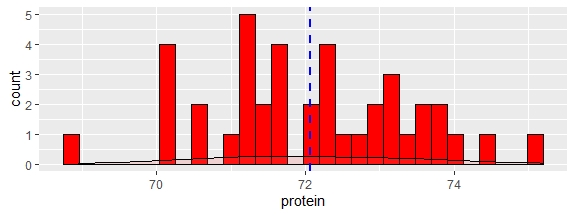
The name of the data frame is "fish1_df", and the first thing I do is to get the histograms to check the distributions for the parameters:

library(tidyverse)
#for the Dry Matter:
fish1_df %>%
ggplot(aes(dm))+
  geom_histogram(fill="blue",col="black")+
  geom_density(alpha=.2, fill="#FF6666") +
  geom_vline(aes(xintercept=mean(dm, na.rm=T)),
               color="red", linetype="dashed", size=1)


fish1_df %>%
ggplot(aes(protein))+
  geom_histogram(fill="red",col="black")+
  geom_density(alpha=.2, fill="#FF6666") +
  geom_vline(aes(xintercept=mean(protein, na.rm=T)),
               color="blue", linetype="dashed", size=1)
 
ggplot(aes(fat))+
  geom_histogram(fill="green",col="black")+
  geom_density(alpha=.2, fill="#FF6666") +
  geom_vline(aes(xintercept=mean(fat, na.rm=T)),
               color="blue", linetype="dashed", size=1)
fish1_df %>%
ggplot(aes(ash))+
  geom_histogram(fill="brown",col="black")+
  geom_density(alpha=.2, fill="#FF6666") +
  geom_vline(aes(xintercept=mean(ash, na.rm=T)),
               color="red", linetype="dashed", size=1)


4 ene 2020

EQA "Estimated Minimum" and "Estimated Maximum" in Win ISI

One of the statistics we can see after an ".eqa" file is generated are these : "Estimated Minimum "  and the "Estimated Maximum".
 
These values are calculated from the ".cal" file (file with the laboratory values distribution) used to develop the calibration for a certain constituent.
 
Take into account that the  ".cal" used to develop the equation can be different than the original ".cal" due that some samples can be taken out as outliers (the ones specified in the ".oll" file).
 
So from the ".cal" file used for the equation file we calculate the Mean Value and the Standard Deviation Value and the Estimated Minimum is calculates as Mean - 3.SD and the "Estimated Maximum is calculated as Mean + 3.SD.
 
If we get a negative value for the Estimated Minimum we replaced it by cero.