Mostrando entradas con la etiqueta Caret. Mostrar todas las entradas

20 sept 2022

NIT Spectroscopic Tutorial with Caret (part 5)

Working these days with the tecator data set traying to find the better statistics as possible for the cross validation, and checking after with the test set. I use algorithms to remove the scatter but at the moment not derivatives to enhance the resolution. I show the statistics results for the CV and the validation results for the test set.

Multiple Scatter Correction has at the moment the better statistics for protein, but still some combinations of Math treatments could be tryed.


This is the XY plot for the test set with the pls model using the train set math treated with MSC.


16 sept 2022

NIT Spectroscopic Tutorial with Caret (part 4)

Looking to the spectra of the previous post was clear that we must apply a pre-treatment to remove the baselines shifts. One way to do it is to treat every spectrum individually, calculating a linear model (absorbance values vs. wavelengths) and getting the values of the slope at every wavelength, after these values are subtracted from the absorption values of the spectrum getting the baseline corrected spectrum. We repeat the process for every spectrum.

This function is available in the package pracma, and its name is detrend. In case we use it for the spectra pre-process in Caret with “center” and “scale”, we change the view from this:


To this:


This way we can see more clearly the variation in the spectra that we can try to interpret some way. Also, with this new pre-treatment we can check if the PCA change some way, and better to find outliers.

One of the options for interpretation are the correlation spectrum (see the correlation of every wavelength with the parameter of interest). In this case we can see how fat is inverse correlated with protein and moisture, and there are some positive correlations between protein and moisture.


We can see this if we run the correlation plot for the parameters;
correlation_par <- cor(endpoints)
library(corrplot)
corrplot(correlation_par, method = "ellipse")


See the code in basic R for the correlation spectra:

cor_moi <- cor(endpoints_train[ , 1], 
               train_scaled_fit)
cor_fat <- cor(endpoints_train[ , 2], 
               train_scaled_fit)
cor_prot <- cor(endpoints_train[ , 3], 
                train_scaled_fit)

matplot(seq(850, 1048, by = 2), t(cor_moi),
        xlab = "Wavelengths", ylab = "Absorbance", 
        main = "Correlation Spectra", type = "l", 
        ylim = c(-1, 1))

par(new = TRUE)

matplot(seq(850, 1048, by = 2), t(cor_fat),
        xlab = " ", ylab = " ", 
        main = " ", type = "l", col = "red", 
        ylim = c(-1, 1))

par(new = TRUE)

matplot(seq(850, 1048, by = 2), t(cor_prot),
        xlab = " ", ylab = " ", 
        main = " ", type = "l", col = "blue", 
        ylim = c(-1, 1))


legend("topright",                    
       legend = c("Moisture", "Fat", "Protein"),
       col = c("black", "red", "blue"),
       lty = 1)

12 sept 2022

NIT Spectroscopic Tutorial with Caret (part 3)

To follow the tutorial yo can see first:
We use two pretreatments in the previous posts to develop the Principal Components Analysis, but we can add another to remove the skewness of the predictor variables. We can see the skewness plotting a histogram of the absorptions at every wavelength, there will be 100 histograms to look, so the best way to check it can be a boxplot spectra (centred and scaled):

boxplot(train_scaled, main = "preProcess(Center + Scale)")

In the plot we can see that are skewness to the right, and some outliers.

Now we can apply the BoxCox algorithm together with Center and Scale and to look at the boxplot spectra:

train_scaled_2 <- preProcess(absorp_train,
                     method = c("BoxCox", "center", "scale"))

boxplot(train_scaled_2, 
        main = "preProcess(BoxCox + Center + Scale)")

The result shows how the skewness is removed. Of course, the PCA calculation will give different scores values, but still two terms will explain almost all the variance.

Looking to the spectra (treated either with “Center” and “Scale”, or “BoxCox”, “Center” and “Scale”) we see that there is a baseline shift that would be convenient that a pretreatment will remove in case we have to see clearly the variability of the fat, protein or moisture content.

6 sept 2022

NIT Spectroscopic Tutorial with Caret (part 2)

The first post of this tutorial brings a nice conversation on tweeter. The idea now, is to use Caret with other packages (necessary for some of the prepocessing of the data), but I will work in parallel at the same time with "tidymodels" packages (a good way to learn how to use them).

Thanks to Max Kuhn for send me a link to some interesting code from James Wade to use the Meat data in the tidyverse and tidymodels environment. By the way the great book "Applied PredictiveModelling" (Max Kuhn & Kjell Johnson) is very useful and this tutorial start as a possible solution for the exercise 6.1 in the book.

One of the problems to work with NIR or NIT spectra is the high collinearity of the predictors, this is due to NIR (Near Infrared Reflectance) and NIT (Near Infrared Transmitance) is formed by overtones (first, second, third) and combination fundamental bands which appear in the MIR (Middle Infrared). Other problem in this type of spectra is the high level of overlaping, and the NIR or NIT contains a lot of hidden information which needs from statistic or mathematical treatments to make them visible in a way that is usefull to develop models. This requires the use of preprocessing methods (centering, scaling, resolution improvement,...), that will be treated along the coming posts.

By the moment we will deal with the spectra without any treatment ("raw spectra"), and we create a correlation matrix to check the collinearity.

correlation <- cor(absorp)
library(corrplot)
corrplot(correlation)


As we can see, all the wavelengths are highly correlated, so we have to reduce some way the number of variables (predictors), looking for other variables,  not correlated and which capture most the variability contained in the spectra matrix without introducing noise. This can be done with the principal component analysis (PCA), and depending on the number of samples we have, we can use as many new variables (we will call them "terms") as predictors, but this will never be the case and we have to decide how many terms we will keep in order not to loose information (underfitting) and do not introduce noise (overfitting).


Before to run the principal component analysis we divide the whole data set into a train set and a test set.

Creating a training/test split: Normally we use 75% random samples for the training set and the remaining 25% for the test set

set.seed(1234)
#Create partition index
data_split <- createDataPartition(endpoints[ ,1], p = .75)
data_split <- data_split$Resample1

# split data
absorp_train <- absorp[data_split, ]
absorp_test <- absorp[-data_split, ]


The test set is taken apart and won´t be used until necessary (by the end of the models development). Refuse to use it to take decisions, it must be totally independent.

When running the PCA we have the option to use some pretreatments

  • Center: The mean spectrum is sustracted from every spectrum.
  • Scale  :  Every spectrum data point is divided by the standard deviation of all the data points in the spectrum.

We can see how center and scale affect to the spectra:

train_scaled <- scale(absorp_train, center = TRUE, 
                     scale = TRUE )
matplot(seq(850, 1048, by = 2), t(train_scaled),
        xlab = "Wavelengths", ylab = "Absorbance",
        main = "Meat spectra", type = "l")


These pretreatments are aplyed to every spectrum individually, so at the end of the preprocess (before developing the PCA) we have a transformed data matrix with the same dimensions (215 . 100).

pca_object <- prcomp(absorp_train, center = TRUE, 
                     scale. = TRUE)
percent_variance <- pca_object$sdev^2/sum(pca_object$sd^2)*100
plot(percent_variance[1:20])
head(percent_variance)
head(pca_object$x[1:5 , 1:2 ])
#scores with just 2 terms


We can see that just a few terms ( two or three) are enough to retain almost all the variance, but let´s calculate this time with Caret the principal components. First we have to give column names to the absorp_train matrix:

wavelengths <- seq(850, 1048, by = 2)
colnames(absorp_train) <- wavelengths
colnames(absorp_train)

trans <- preProcess(absorp_train, 
                    method = c("center", "scale", "pca"))
trans #info about the PCA calculation
transformed <- predict(trans, absorp_train)
head(transformed[1:2 , ]) 
#scores with the 2 recommended terms (95% variance explained)

by default the threshold for the maximum explained variance variance is 95%, but we can increase it if necessary. (in the coming post we will apply other methods to see if applying a correction to the skewness of the predictors improves the results).

Both methods give the same score and loading matrix that we will interpret in a coming post.

5 sept 2022

NIT Spectroscopic Tutorial with Caret (part 1)

Along several posts we will practice the use of Caret with spectroscopic data from an Infratec Instrument. The first thing we will do, is to load the library and the data which contain the spectroscopic and reference values.

#Loading the data
    library(caret)
    data(tecator)
    ?caret::tecator #Details about the tecator data

Two tables are loaded, one with the spectroscopic data (absorp), and another with the reference values (endpoints).

        dim(endpoints)
   dim(absorp)

We can see that we have 215 samples measured at 100 data points in the spectroscopic data, and three parameters with reference values.

The data points goes from 850 to 1048 every two nm, so they are in total 100 data points, and the reference values are for Moisture, Fat and Protein. As we can read in the Help info, the samples are chopped pure meat measured in transmittance.

We can see first the structure of the data is numeric

    str(absorp)
  str(endpoints)

and their class (matrix)

    class(absorp)
    class(endpoints)

We have a matrix for the absorption values and a matrix for the reference values. Let´s see the raw spectra

    matplot(seq(850, 1048, by = 2), t(absorp),
                 xlab = "Wavelengths", ylab = "Absorbance",
                 main = "Meat spectra", type = "l")

As we can see, due to the particle size, differences in the pathlength and other physical circumstances, there is quite a lot scatter in the spectra, so this physical variables are with others (chemical) data that we will have to treat and manage to develop models.

30 may 2021

Working with Soilspec data (part 10)

 Now it is time for regressions and prediction for all the parameters using the selected spectra with the "puchwain"  function, and for test, the non selected ones.

We develop the regressions with Caret using PLS and Cross Validation (the model choose 5 terms).

model_clay_snvdt <- train(y_sel_clay ~.,data=trainDataClay,  
                          method = "pls", scale = TRUE,
                          trControl = trainControl("cv", number = 10),
                          tuneLength = 20)

We can plot the predictions of the Training Set (selected samples) with the predictions of the Test Set (non selected Samples) for every parameter. I do in this case for Clay :


14 ene 2021

R exercises 3.1 (part 4)

 We have seen the score maps and the loading, but we can see both in the same plot?. That way we can relate the samples with the predictors weights. Well, this can be done with the biplot function with just a few lines of code once the PCs are calculated:

biplot(pcaObject, choices = 1:2, col =c("blue", "red"))

biplot(pcaObject, choices = 2:3, col =c("blue", "red")) 


12 ene 2021

R exercises 3.1 (part 3)

 In the previous plot we have seen the score plots trying to see some clusters or looking for some groupings based on the "Type" variable.  We have seen the correlation plot as well for the Glass data set and now it is time for the loadings plots.

The loadings plots are useful to understand how the predictors are associated with the several components. In the case of the Glass data set we can see the predictors weights for the first 3 principal components:


As we saw in the correlation plot (in a previous post) RI and CA are very close in both plots and that means that they are highly correlated.  We can se how "Ba" and "Mg" are inverse correlated and have a high weight for PC2 and almost not weight for PC3. There are a lot of conclusions we can take out for the loading plots.

In blue the code I use to get the plots:

plot(transformed[,2:3], col = Type, pch = 1,
    xlab = paste("PC 1 (", variance[1], "%)", sep = ""),
    ylab = paste("PC 2 (", variance[2], "%)", sep = ""))

plot(trans$rotation[,1],trans$rotation[,2],type = "n",
    xlab = paste("PC 1 (", variance[1], "%)", sep = ""),
    ylab = paste("PC 2 (", variance[2], "%)", sep = ""))

text(trans$rotation[,1:3], labels = rownames(trans$rotation))

plot(transformed[,3:4], col = Type, pch = 1,
    xlab = paste("PC 2 (", variance[2], "%)", sep = ""),
    ylab = paste("PC 3 (", variance[3], "%)", sep = ""))

plot(trans$rotation[,2],trans$rotation[,3],type = "n",
    xlab = paste("PC 2 (", variance[2], "%)", sep = ""),
    ylab = paste("PC 3 (", variance[3], "%)", sep = ""))

text(trans$rotation[,2:3], labels = rownames(trans$rotation))


4 ene 2021

R exercises 3.1 (part 2)

As we can see in the previous post, there are highly correlated variables (RI and Ca) and other that we can consider medium or low correlated, and even that are not correlated at all.

In the case of the histograms we can see that some variables are skewed and in some cases it appears that the are some extreme outliers (like in the "K"), but at the moment we does not exclude any of the samples.

We can check with the PCA analysis if there are some transformations which can reduce the number of variables. We can see in the type variable that we have seven classes, so we can check at the same time if we can observe some clusters in the PC space for these classes.

pcaObject<- prcomp(Glass[,1:9], center = TRUE, scale. = TRUE)
#Percent of variance explained for every component
round(pcaObject$sd^2/sum(pcaObject$sd^2)*100, 1)

[1] 27.9 22.8 15.6 12.9 10.2  5.9  4.1  0.7  0.0

As we can see the number of dimensions in the decrease (from 9 to 8) due to the high correlation between two of the variables. Now we can plot the scores maps to see if we can find some clusters.

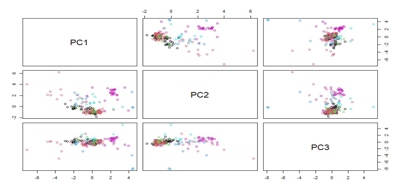
pairs(pcaObject$x[,1:3], col = Type)


PCA is a not supervised method and we can see possible clusters but with different classes overlapped, so we have to work trying to find some transformations which improve as much as possible the classification methods.

We can use now Caret to reduce improve the skewed  variables and  check if there are some improvement in the classification of types:

library(caret)
trans<- preProcess( Glass[,1:9], 
                    method = c("BoxCox", 
                    "center", "scale", "pca"))
transformed<- predict(trans, Glass)
pairs(transformed[,2:4], col = Type)


We can compare the PC1 vs PC2 score map for both cases


As we can see they are very similar and it does not seem to make so much improvement the PCA and reduction of the skewness to classify correctly some of the groups.

3 ene 2021

R exercises 3.1

The idea of this blog for this year 2021, is to write posts about machine learning techniques for all the kind of data sets available in the R packages or  from other sources different to NIR or spectroscopy using different chemometric packages. Is important to learn all the basics and techniques to apply them later to spectroscopy data sets. Now for some time we will use the Caret package following the book "Applied Predictive Modelling" exercises. But, of course as soon as I can share more posts about NIR I will do.

One of the data frames available in R (in the mlbench package) is "Glass". From the package help we get the description:

Description
A data frame with 214 observation containing examples of the chemical analysis of 7 different types of glass. The problem is to forecast the type of class on basis of the chemical analysis. The study of classification of types of glass was motivated by criminological investigation. At the scene of the crime, the glass left can be used as evidence (if it is correctly identified!).
A data frame with 214 observations on 10 variables:
[,1] RI refractive index
[,2] Na Sodium
[,3] Mg Magnesium
[,4] Al Aluminum
[,5] Si Silicon
[,6] K Potassium
[,7] Ca Calcium
[,8] Ba Barium
[,9] Fe Iron
[,10] Type Type of glass (class attribute)

The first thing to do is to load the package and the data in our workspace and check their structure:

library(mlbench)
data("Glass")
head(Glass)
str(Glass)

Now we can place the predictor variables apart, and the "Type" variable alone:

Type<-Glass$Type
GlassData<-Glass[,-10]

The exercise of the book suggest: Using visualizations explore the predictors variables to understand their distributions as well as the relationships between predictors. So I check the distributions and the histograms if necessary:

library(e1071)
glassSkewValues<-apply(GlassData,2,skewness)
glassSkewValues

  RI    Na    Mg    Al    Si     K    Ca    Ba    Fe 
 1.60  0.45 -1.14  0.89 -0.72  6.46  2.02  3.37  1.73 

If the values are close to 0, it could mean that we have a normal distribution,  and if the number are positive or negative is a sign that the data is skewed to the right or to the left, so we can check the histograms of  "Na", "K" and "Mg".

par(mfrow = c(2,2))
hist(GlassData$Na, col= "blue")
hist(GlassData$Mg, col= "blue")
hist(GlassData$K, col= "blue")


Now let´s check the intercorrelation between the predictor variables:

library(corrplot)
correlations<-cor(GlassData)
corrplot(correlations, order = "hclust")

And the resulting plot give us a great view of the intercorrelations between them:

We will continue with this exercise in the next post.

25 ene 2020

Comparing "R-PLS", "CARET" and "WIN ISI"

I made this exercise just for fun. When we develop a regression we don´t have to look the the XY plot where a sample is predicted from a model where this sample is already included, we have to compare it against a model where she is excluded. So we have to look to see how the samples fits to the regression line to the XY plot of Cross Validation for the number of terms we have selected for the final model.
 
In this case I develop the comparison for a regression of protein in fish meal with the 40 samples I am using in the series of tutorials about "Tidyverse and Chemometrics" using the PLS  and Caret packages and also Win ISI (FOSS Analytical Chemometric software).
 
PLS, Win ISI and Caret recommend 8 terms and as you can see they gave the same LOO Cross Validation XY plots or very similar. Remember that these are the XY plots of predictions where every sample is predicted with the 39 remaining so it´s more realistic of how it will performs in routine.


2 may 2019

Using "tecator" data with Caret (part 4)

I add one more type of regression to the "tecator meat data" in this case is the "Ridge Regression".
Ridge Regression use all the predictors, but penalizes their values in order they can not get high values.

We can see that it not get such as best fitting as the PCR or PLS in the case of spectroscopy data, but it is quite common to use it in other data for Machine Learning Application. Ridge Regression is a type of Regularization where we have two types L1 and L2.

In the plot you can see also the RMSE for the validation set:

Of course PLS works better, but we must try other models and see how the affect to the values.

25 abr 2019

Using "tecator" data with Caret (part 3)

This is the third part of the series "Using Tecator data with Caret" , you can read first the posts:
 
 
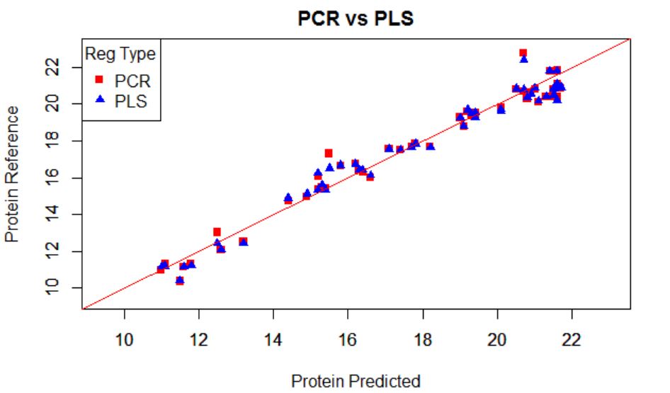
When developing the regression for protein, Caret select the best option for the number of terms to use in the regression, so in this case that I have developed two regressions (PCR and PLS), Caret select 11 terms for the PLS regression and 14 for the PCR.
 
This  is normal because in the case of PLS all the terms are selected taking in account how the scores (projections over the terms) correlate with the  reference values for  the parameter of interest, so they rotate to increase as much as possible the correlation value of the scores to the reference values. In the case of PCR the terms explain the variability in the spectra matrix and after a multiple linear regression is developed with these scores and is in this moment when the reference values are take it into account.
 
In this plot I show the XY plot of reference values of predictions vs. reference values for PCR and PLS over-plotted, with a validation set (sample removed randomly for testing the regression)
 
 
The error are similar for both:
 
RMSEP  for PCR..................0,654
RMSEP  for PLS...................0,605


23 abr 2019

Using "tecator" data with Caret (part 2)

I continue with the exercise of Tecator data from the :
Chapter 6 | Linear Regression and Its Cousins
in the book Applied Predictive Modelling.

In this exercise we have to develop different types of regression and to decide which performs better.
I use for the exercise math treatments to remove the scatter, in particular the SNV + DT with the package "prospectr".

After I use the "train" function from caret to develop two regressions (one with PCR and the other with PLS) for the protein constituent.

Now the best way to decide is a plot showing the RMSE for the different number of components or terms:


Which one do you thinks performs better?.
How many terms would you choose?

I will compare this types of regressions with others in coming posts for this tecator data.

11 ene 2019

Correcting skewness with Box-Cox

We can use with Caret the function BoxCoxTrans to correct the skewness. With this function we get the lambda value to apply to the Box-Cox formula, and get the correction. In the case of lambda = 0 the Box-Cox transformation is equal to log(x), if lambda = 1 there are not skewness so not transformation is needed, if equals 2 the square transformation is needed and several math functions can be applied depending of the lambda value.

In the case of the previous post (correcting skewness with logs)if we use the Caret function "BoxCoxTrans", we get this result:

> VarIntenCh3_Trans
Box-Cox Transformation

1009 data points used to estimate Lambda
Input data summary:
  Min.  1st Qu.   Median     Mean  3rd Qu.     Max.
0.8693  37.0600  68.1300 101.7000 125.0000 757.0000

Largest/Smallest: 871
Sample Skewness: 2.39

Estimated Lambda: 0.1
With fudge factor, Lambda = 0 will be used for transformations


So, if we apply this transformation, we will get the same skewness value and histogram than when applying logs.


9 ene 2019

Correcting the skewness with logs

It is recommended to look to the histograms to check if the distributions of the predictors, variables or constituents are skewed in some way. I use in this case a predictor of the segmentation original data from the library "Applied Predictive Modeling". where we can find many predictor to check if the cell are well or poor segmented.
If you want to check the paper for this work you can see this link:
 
One of the predictors for this work is VarIntenChn3, and we can check the histogram:
hist(segData$VarIntenCh3)
skewness(segData$VarIntenCh3)
              [1] 2.391624
As we can see the histogram is skewed to the right, so we can apply a transformation to the data to remove the skewness. There are several transformations, and this time we check applying Logs.
 
VarIntenCh3_log<-log(segData$VarIntenCh3)
hist(VarIntenCh3_log)
skewness(VarIntenCh3_log)    
               [1] -0.4037864
 
As we can see the histogram looks more to a Normal distribution, but a little bit skewed to the left.


6 ene 2019

Correlation Plots (Segmentation Data)

First I would like to wish to the readers of this blog all the best along this 2019.
 
Recently it has been my birthday and I receive as present the book "Applied Predictive Modelling" wrote by Max Kuhn and Kjell Johnson. It is really a great book for those who like R for predictive modelling and to get more knowledge about the Multivariate Analysis. Sure a lot of post will come inspired by this book along this year.
 
I remember when I started with R in this blog I post plots of the correlation matrix to show how the wavelengths in a near infrared spectrum are correlated and why for that reason we have to use techniques like PCA to create uncorrelated predictors.
 
In R there is a package called like the book "Applied Predictive Modelling", where we can find the "Cell Segmentation Data", which Max Kuhn use quite often on his webinars (you can find them available in YouTube).
 
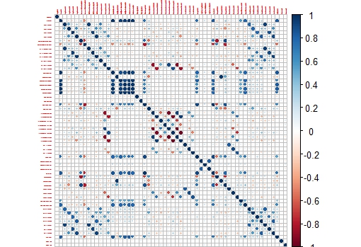
These Cell Segmentation Data has 61 predictors, and we want to see the correlation between them, so with some code we isolate the training data and use only the numeric values of the predictors to calculate the correlation matrix:

library(caret)
library(AppliedPredictiveModeling)

library(corrplot)
data(segmentationData)   # Load the segmentation data set
trainIndex <- createDataPartition(segmentationData$Case,p=.5,list=FALSE)
trainData <- segmentationData[trainIndex,]
testData  <- segmentationData[-trainIndex,]
trainX <-trainData[,4:61]        # only numeric values

M<-cor(trainX)
corrplot(M,tl.cex = 0.3)


This way we get a nice correlation plot:


 This plot is easier to check than the whole correlation matrix in numbers.

Now we can isolate areas of this matrix, like the one which shows higher correlation between the variables:

corrplot(M[14:20,14:20],tl.cex = 0.8