14 ene 2021

R exercises 3.1 (part 4)

 We have seen the score maps and the loading, but we can see both in the same plot?. That way we can relate the samples with the predictors weights. Well, this can be done with the biplot function with just a few lines of code once the PCs are calculated:

biplot(pcaObject, choices = 1:2, col =c("blue", "red"))

biplot(pcaObject, choices = 2:3, col =c("blue", "red")) 


12 ene 2021

R exercises 3.1 (part 3)

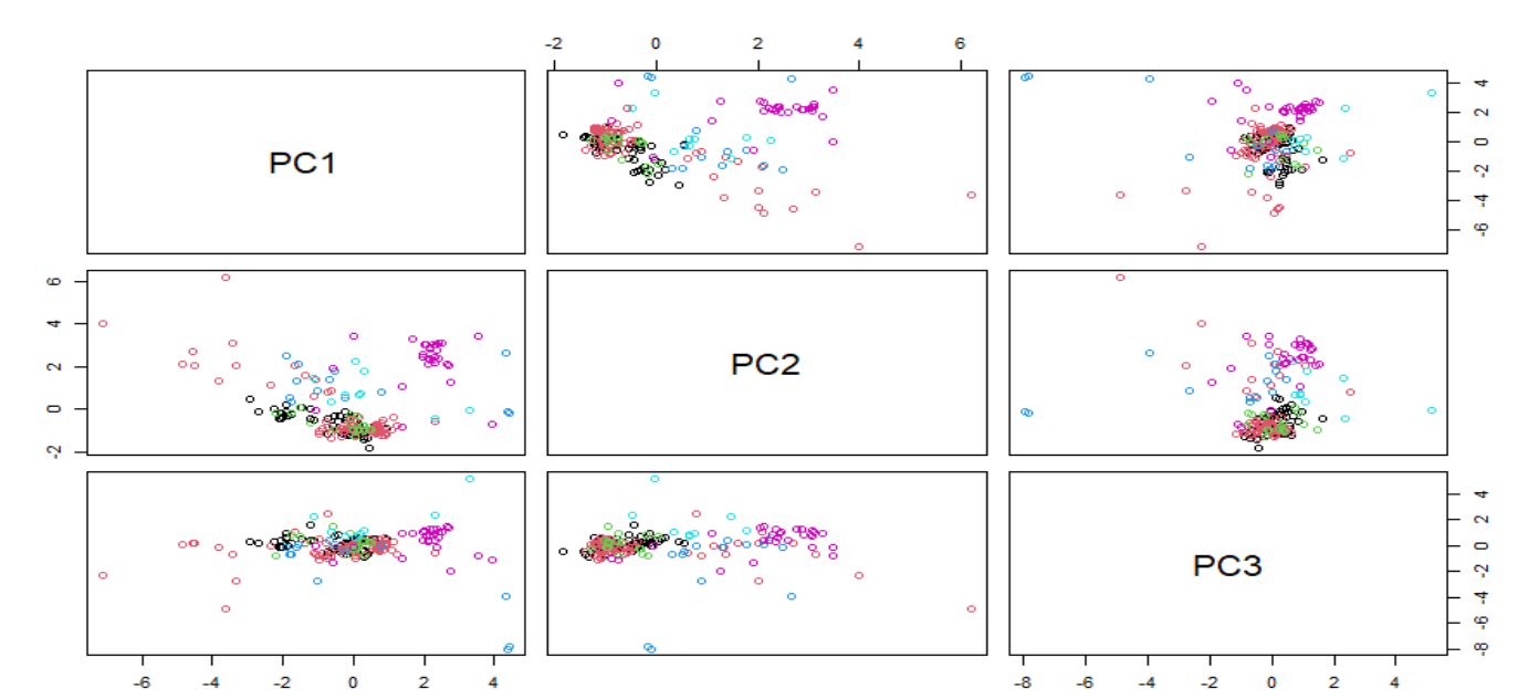
 In the previous plot we have seen the score plots trying to see some clusters or looking for some groupings based on the "Type" variable.  We have seen the correlation plot as well for the Glass data set and now it is time for the loadings plots.

The loadings plots are useful to understand how the predictors are associated with the several components. In the case of the Glass data set we can see the predictors weights for the first 3 principal components:


As we saw in the correlation plot (in a previous post) RI and CA are very close in both plots and that means that they are highly correlated.  We can se how "Ba" and "Mg" are inverse correlated and have a high weight for PC2 and almost not weight for PC3. There are a lot of conclusions we can take out for the loading plots.

In blue the code I use to get the plots:

plot(transformed[,2:3], col = Type, pch = 1,
    xlab = paste("PC 1 (", variance[1], "%)", sep = ""),
    ylab = paste("PC 2 (", variance[2], "%)", sep = ""))

plot(trans$rotation[,1],trans$rotation[,2],type = "n",
    xlab = paste("PC 1 (", variance[1], "%)", sep = ""),
    ylab = paste("PC 2 (", variance[2], "%)", sep = ""))

text(trans$rotation[,1:3], labels = rownames(trans$rotation))

plot(transformed[,3:4], col = Type, pch = 1,
    xlab = paste("PC 2 (", variance[2], "%)", sep = ""),
    ylab = paste("PC 3 (", variance[3], "%)", sep = ""))

plot(trans$rotation[,2],trans$rotation[,3],type = "n",
    xlab = paste("PC 2 (", variance[2], "%)", sep = ""),
    ylab = paste("PC 3 (", variance[3], "%)", sep = ""))

text(trans$rotation[,2:3], labels = rownames(trans$rotation))


4 ene 2021

R exercises 3.1 (part 2)

As we can see in the previous post, there are highly correlated variables (RI and Ca) and other that we can consider medium or low correlated, and even that are not correlated at all.

In the case of the histograms we can see that some variables are skewed and in some cases it appears that the are some extreme outliers (like in the "K"), but at the moment we does not exclude any of the samples.

We can check with the PCA analysis if there are some transformations which can reduce the number of variables. We can see in the type variable that we have seven classes, so we can check at the same time if we can observe some clusters in the PC space for these classes.

pcaObject<- prcomp(Glass[,1:9], center = TRUE, scale. = TRUE)
#Percent of variance explained for every component
round(pcaObject$sd^2/sum(pcaObject$sd^2)*100, 1)

[1] 27.9 22.8 15.6 12.9 10.2  5.9  4.1  0.7  0.0

As we can see the number of dimensions in the decrease (from 9 to 8) due to the high correlation between two of the variables. Now we can plot the scores maps to see if we can find some clusters.

pairs(pcaObject$x[,1:3], col = Type)


PCA is a not supervised method and we can see possible clusters but with different classes overlapped, so we have to work trying to find some transformations which improve as much as possible the classification methods.

We can use now Caret to reduce improve the skewed  variables and  check if there are some improvement in the classification of types:

library(caret)
trans<- preProcess( Glass[,1:9], 
                    method = c("BoxCox", 
                    "center", "scale", "pca"))
transformed<- predict(trans, Glass)
pairs(transformed[,2:4], col = Type)


We can compare the PC1 vs PC2 score map for both cases


As we can see they are very similar and it does not seem to make so much improvement the PCA and reduction of the skewness to classify correctly some of the groups.

3 ene 2021

R exercises 3.1

The idea of this blog for this year 2021, is to write posts about machine learning techniques for all the kind of data sets available in the R packages or  from other sources different to NIR or spectroscopy using different chemometric packages. Is important to learn all the basics and techniques to apply them later to spectroscopy data sets. Now for some time we will use the Caret package following the book "Applied Predictive Modelling" exercises. But, of course as soon as I can share more posts about NIR I will do.

One of the data frames available in R (in the mlbench package) is "Glass". From the package help we get the description:

Description
A data frame with 214 observation containing examples of the chemical analysis of 7 different types of glass. The problem is to forecast the type of class on basis of the chemical analysis. The study of classification of types of glass was motivated by criminological investigation. At the scene of the crime, the glass left can be used as evidence (if it is correctly identified!).
A data frame with 214 observations on 10 variables:
[,1] RI refractive index
[,2] Na Sodium
[,3] Mg Magnesium
[,4] Al Aluminum
[,5] Si Silicon
[,6] K Potassium
[,7] Ca Calcium
[,8] Ba Barium
[,9] Fe Iron
[,10] Type Type of glass (class attribute)

The first thing to do is to load the package and the data in our workspace and check their structure:

library(mlbench)
data("Glass")
head(Glass)
str(Glass)

Now we can place the predictor variables apart, and the "Type" variable alone:

Type<-Glass$Type
GlassData<-Glass[,-10]

The exercise of the book suggest: Using visualizations explore the predictors variables to understand their distributions as well as the relationships between predictors. So I check the distributions and the histograms if necessary:

library(e1071)
glassSkewValues<-apply(GlassData,2,skewness)
glassSkewValues

  RI    Na    Mg    Al    Si     K    Ca    Ba    Fe 
 1.60  0.45 -1.14  0.89 -0.72  6.46  2.02  3.37  1.73 

If the values are close to 0, it could mean that we have a normal distribution,  and if the number are positive or negative is a sign that the data is skewed to the right or to the left, so we can check the histograms of  "Na", "K" and "Mg".

par(mfrow = c(2,2))
hist(GlassData$Na, col= "blue")
hist(GlassData$Mg, col= "blue")
hist(GlassData$K, col= "blue")


Now let´s check the intercorrelation between the predictor variables:

library(corrplot)
correlations<-cor(GlassData)
corrplot(correlations, order = "hclust")

And the resulting plot give us a great view of the intercorrelations between them:

We will continue with this exercise in the next post.