27 ene 2019

An aplication of ANN in Near Infrared (Protein in wheat with Infratec)

This paper shows how the ANN algorithms can be applied to NIR technology:

Artificial Neural Networks and Near Infrared Spectroscopy - A case study on protein content in whole wheat grain

The authors explain why the IFT calibrations are so robust for wheat. This is a case where more than 40000 samples are used with all the variability we can imagine for this type of product.

You can see the videos:

How Deep Neural Networks work?
What do Neural Networks learn?

for a better understanding of how ANN works.

How Deep Neural Networks Work


This is another video from Brandon Rohrer. I add another one two posts ago called "What do Neural Networks learn?  ". I add to these posts the tag "Artificial Neural Networks" to come back to see them whenever needed.

ANN are becoming quite popular and there is more a more interest to see how they work and how to apply them to the NIR spectra.
Meanwhile we try to understand as much as possible what can be considered as a black box. Thanks to Bandon for these great tutorial videos.

23 ene 2019

Box plot spectra

I have been working this day quite a lot with the concept of good product, and the spectrum with boxplots is a niece example to detect samples which can be contaminated or not to be good product.
 
Always in the case that the good product could be the average spectrum of N samples considered or tested that are good, we can define with all the good samples a boxplot spectra, and over-plot over it new samples and see if they are out of the limits at certain wavelengths, so this can be a clue for a contamination, a confusion in the mixture with the percentages or the components of the mixture.


18 ene 2019

Using RMS statistic in discriminant analysis (.dc4)

In the case we want to check if a certain spectrum belongs to a certain product we can create an algorithm with PCA in such a way that this algorithm try to reconstruct the unknown spectrum with the scores of this unknown spectrum on the PCA space of the product, and the loadings of the product. So we have the reconstructed spectrum of the unknown and the original spectrum of the unknown.
 
If we subtract one from the another we get the Residual spectrum which is really informative. We can calculate the RMS value of this spectrum to see if the unknown spectrum is really well reconstructed so the RMS values is small (RMS is used as statistic to check the noise in the diagnostics of the instrument).
 
Find the right cutoff to check if the sample is well reconstructed depends of the type of sample and sample presentation.
 
Win ISI multiply the RMS by 1000, so the default value for this cutoff which is 100 in reality is 0.1, anyway a smaller or higher value can be used depending of the application.
 
This type of discrimination is known as RMS-X residual in Win ISI 4 and create ".dc4" models.
 
We see in next posts other ways to use this RMS residual.

11 ene 2019

Correcting skewness with Box-Cox

We can use with Caret the function BoxCoxTrans to correct the skewness. With this function we get the lambda value to apply to the Box-Cox formula, and get the correction. In the case of lambda = 0 the Box-Cox transformation is equal to log(x), if lambda = 1 there are not skewness so not transformation is needed, if equals 2 the square transformation is needed and several math functions can be applied depending of the lambda value.

In the case of the previous post (correcting skewness with logs)if we use the Caret function "BoxCoxTrans", we get this result:

> VarIntenCh3_Trans
Box-Cox Transformation

1009 data points used to estimate Lambda
Input data summary:
  Min.  1st Qu.   Median     Mean  3rd Qu.     Max.
0.8693  37.0600  68.1300 101.7000 125.0000 757.0000

Largest/Smallest: 871
Sample Skewness: 2.39

Estimated Lambda: 0.1
With fudge factor, Lambda = 0 will be used for transformations


So, if we apply this transformation, we will get the same skewness value and histogram than when applying logs.


9 ene 2019

Correcting the skewness with logs

It is recommended to look to the histograms to check if the distributions of the predictors, variables or constituents are skewed in some way. I use in this case a predictor of the segmentation original data from the library "Applied Predictive Modeling". where we can find many predictor to check if the cell are well or poor segmented.
If you want to check the paper for this work you can see this link:
 
One of the predictors for this work is VarIntenChn3, and we can check the histogram:
hist(segData$VarIntenCh3)
skewness(segData$VarIntenCh3)
              [1] 2.391624
As we can see the histogram is skewed to the right, so we can apply a transformation to the data to remove the skewness. There are several transformations, and this time we check applying Logs.
 
VarIntenCh3_log<-log(segData$VarIntenCh3)
hist(VarIntenCh3_log)
skewness(VarIntenCh3_log)    
               [1] -0.4037864
 
As we can see the histogram looks more to a Normal distribution, but a little bit skewed to the left.


6 ene 2019

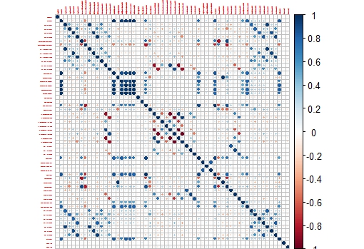
Correlation Plots (Segmentation Data)

First I would like to wish to the readers of this blog all the best along this 2019.
 
Recently it has been my birthday and I receive as present the book "Applied Predictive Modelling" wrote by Max Kuhn and Kjell Johnson. It is really a great book for those who like R for predictive modelling and to get more knowledge about the Multivariate Analysis. Sure a lot of post will come inspired by this book along this year.
 
I remember when I started with R in this blog I post plots of the correlation matrix to show how the wavelengths in a near infrared spectrum are correlated and why for that reason we have to use techniques like PCA to create uncorrelated predictors.
 
In R there is a package called like the book "Applied Predictive Modelling", where we can find the "Cell Segmentation Data", which Max Kuhn use quite often on his webinars (you can find them available in YouTube).
 
These Cell Segmentation Data has 61 predictors, and we want to see the correlation between them, so with some code we isolate the training data and use only the numeric values of the predictors to calculate the correlation matrix:

library(caret)
library(AppliedPredictiveModeling)

library(corrplot)
data(segmentationData)   # Load the segmentation data set
trainIndex <- createDataPartition(segmentationData$Case,p=.5,list=FALSE)
trainData <- segmentationData[trainIndex,]
testData  <- segmentationData[-trainIndex,]
trainX <-trainData[,4:61]        # only numeric values

M<-cor(trainX)
corrplot(M,tl.cex = 0.3)


This way we get a nice correlation plot:


 This plot is easier to check than the whole correlation matrix in numbers.

Now we can isolate areas of this matrix, like the one which shows higher correlation between the variables:

corrplot(M[14:20,14:20],tl.cex = 0.8