21 dic 2012

Happy Christmas / Feliz Navidad


Desearos a todos los lectores de NIR-Quimiometría una ¡Feliz Navidad!.
y un Prospero y Feliz Año
 2013

I wish to all "NIR-Quimiometría" readers a Happy Christmas.

John Lennon says "Happy Christmas War is over"
Let´s hope to tell you some day:
"Happy Christmas Crisis is over"


13 dic 2012

Videos from Coursera’s four week course in R

Good information from the blog Revolution. Go to his post for more details.

Let´s keep these links in my label: "VIDEO: R Tutorials" to improve our R knowledge.

Laura Suttle : R tutorial videos

Laura Suttle : R tutorial videos

"R" : Identifying peaks

The function "identify"  from "R",  is very useful to check the spectrum for peaks or areas of interest. I use it here to see the wavelength with the highest variability in the Shootout-2012 Calibration Set.

This wavelength has a high variability due to the changes in concentration of the Active component in the mixture.

See the video to see how I use the function:


There are two books that I recomend to have to practice Chemometrics in R, you can find the links to get them from Amazon. Now that Christmas time is coming they can be nice presents to somebody. I will use them quite often as Bibliography in this blog.

We can use the identify option to check for the variables in X with the highest extreme loadings. In this case I use the element "rotation" generated by the object "prcomp".

Let´s use the same sample set as before: Shootout-2012 Calibration Set, and see the video:


As you can see the 216 value has the extreme value in both plots.


4 dic 2012

Why this bias? (Process)

I had a new set of samples for validation (process system), as I said in other posts, this is an exciting moment: Will the  calibration performs well?

My first reaction is to look to the plots (Lab vs Predicted). In this case I had this surprising plot:

There are some samples marked as x which have a bias. These are 12 samples (one for batch of flour production), taken randomly during the batch production. It is clear that something happened during the process, and that produced a bias, giving 3 points more of protein during that period.

I expected to have the same problem for moisture, ..., it was not so much, but all these samples has also a bias , being the residuals (Lab - Predicted) positive for all of them.


Same for ash, again these samples are apart from the others.


It is clear that something is happening with these samples. We have to take a look to the spectra.

To be continued.....

29 nov 2012

Making things easier: Regression coefficients.


The idea of this post is: "Dont forget when you develop a regression, to look to the plots and try to interpret them".

Start making things easier. Sometimes easier things are more robust and stable.

23 nov 2012

Shootout 2012 : first PLS regressions

It´s time to start developing some regressions in order to find the best math treatment, the best number of terms, the best spectral regions, the best regression method,....

This time I´m working with the PLS  package in R, and just to make more familiarity with it, I us the pls regression, with the full range, and with two math treatments.: MSC and SG Filters (with first and second derivatives). I will try in other post to select spectral regions, or even other regression methods. 

Indeed to look to the Cross Validation statistics I will look to the prediction statistics for the test set. We have seen that the samples in this set are not fully represented by the training set, and if we predict them fine is a symptom that the equation is robust. Don´t forget that the idea is to predict as better as possible a validation set, which in theory we don´t know the values. (we already know them and I will compare my results in the future with the winner, and other participants).

I develop a regression (1) with MSC, and I look to the prediction statistics for the test set:
>Active_reg1<- pls(Active~NIT.msc,ncomp=5,data=shootcalmsc.2012 , validation = "LOO")
>RMSEP(Active_reg1,newdata=shoottestmsc.2012)

(Intercept)      1 comps      2 comps      3 comps      4 comps      5 comps 
     1.1637       0.6944       0.5028       0.4586       0.4913       0.5355


Now the regression (2) with a SG filter (first derivative)
>Active_reg2<- plsr(Active~NITsg, ncomp =5,data=shootcalsg.2012 , validation = "LOO")
>RMSEP(Active_reg2,newdata=shoottestmsc.2012)
(Intercept)      1 comps      2 comps      3 comps      4 comps      5 comps 
     1.1637       1.0414       0.4172       0.4313       0.4531       0.4556


In case that the SG filter has the second derivative, the RMSEP statistics are:
(Intercept)      1 comps      2 comps      3 comps      4 comps      5 comps 
     1.1637       0.5506       0.4269       0.4227       0.4134       0.4009


We can have a look to the Predicted vs. Lab plots:
>predplot(Active_reg1,ncomp=3,newdata=shoottestmsc.2012,asp=1,line=TRUE,main="MSC math-treatment")>predplot(Active_reg2,ncomp=2,newdata=shoottestsg.2012,asp=1,line=TRUE,main="SG second der")


Well, The plots are not really nice, It is clear that we can separate the two groups, but the results are not very accurate. I have to continue working on it in order to see if I improve this plot, looking to the RMSEP.
We can play with the parameters of the SG filter and try, but I think is better to select spectral regions. I will let you know in other post.

If you are interested in this post, there are some previous ones you can find also interesting:
"Sample Sets" plots (Shootout-2012)
Shootout 2012: Test & Val Sets proyections
Working with Shootout - 2012 in R (001)
Shootout 2012 files

16 nov 2012

VIDEO: Looking to the regression coefficients in R


Bonus:
There is another function to plot the regression coefficients: "coefplot"
I can use it in this case:
coefplot(Active_reg1, ncomp = 1:5,separate=TRUE)
to get this nice plot of the regression coefficients with one to five terms:

14 nov 2012

VIDEO: Looking to the loadings in R


Bonus:
You can use also this option:
plot(Active_reg1,"loadings",comps=1:3,legendpos="topleft")
to get this nice plot of the first three loadings:

11 nov 2012

"Sample Sets" plots (Shootout-2012)

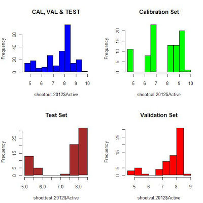
Histograms of all the sample sets together and individually
Raw Spectra


Spectra treated with MSC (Multiple Scatter correction)
Spectra treated with SG filters


7 nov 2012

Shootout 2012: Test & Val Sets proyections

It is obvious (after seeing the spectra of the calibration set), that we have at least three clusters, and that this can be related with the concentration of the active ingredient in the tablets. If we see the scores in the PC1-PC2 score map we will see the three clusters.
I have imported the test set into R, and I did project the test set into the PC1-PC2 score map (developed with the calibration samples), and I found another cluster.
If we read the Chemometrics Shootout rules, we see:
“This year’s challenge will consist in developing the best model for the active
ingredient using the calibration data. However, the most important task will be to build a
model that will be robust to production scale differences. In addition, the quality of the
presentation and the reasoning behind the approach taken will be used to determine the
winner”.
So to predict as accurate as possible this test set is important to approach the challenge.
And what about the Validation Set.We don´t know the reference values, but we can project the samples again into the PC1-PC2 score map (developed with the calibration samples) in order to see more clusters, or if the samples are represented in the Training Set.
As we can see some test and validation samples do not overlap with any samples of the calibration set, so we have to consider this when developing the model.
R is really wonderful making these plots:

Black circles: Calibration Samples
Red triangles: Test Samples
green crosses: Validation samples


29 oct 2012

Working with Shootout - 2012 in R (001)

I have downloaded (from the IDRC) the ASCII files of the Shootout 2012 (see: Shootout 2012 files), so I can work with the data  to develop a model and predict a Validation Set.
For that task I have a "Calibration Set", and a  "Test Set".
We can read details for this task in the IDRC web page: "instructions".
Spectra is acquire in an FTIR instrument, and the space between wavelengths (X axis) is non linear, so I changed it by values 1.0, 2.0,.......,372.0.
wavelengths<-seq(1.0,372.0,by=1)
I had to arrange the data to import it into R, and to organize the data frame in order to start with the observation of the spectra  and the distribution.
As in other posts I am going to use "Chemometrics with R" package.
If we plot the calibration samples without any treatment we see like two sets of samples. This is an indication (as we work in transmittance) that probably there are differences in the pathlength:

Now we can apply the MSC (Multiple Scatter Correction) to reduce this physical proprieties and to enhance the chemical changes:
MSC here works really well and we can see that most of the variability is in the area from 200 to 240 aproximatelly.
wave_var<-seq(200.0,240.0,by=1)
matplot(wave_var,t(NITmsc[,200:240]),lty=3,pch=20,
+ lwd=0.1,xlab="wavelengths",ylab="T%")
Now we can see at less 3 clusters.
Let´s have a look now to the histogram:
hist(Active,col="blue")
We can start to get some conclusions to continue.


26 oct 2012

Getting a representative sample – 02

Sunflower seed requires special procedure to be analysed by NIR. It is important to get a representative sample to be analysed (see: Getting a representative sample – 01 ), and the sample must be presented to the instrument in the best posible way in order to reduce the sampling error.Customers require a representative prediction value, because a lot of money is involve.
La semilla de girasol requiere de un procedimiento especial para su análisis por NIR. Es importante obtener una muestra representativa para ser analizada (ver: Getting a representative sample – 01  ), y dicha muestra debe de ser presentada al equipo NIR de la mejor manera posible para reducir el error de muestreo. Los clientes requieren un valor de predicción representativo, ya que mucho dinero está en juego.

Grind the sample / Moliendo la muestra
Be sure to remove everything from the grinder
Asegurarse de vaciar bien el molino
Good homogenizing of the sample
Homogenizar bien la muestra
After this step we fill the cup and analyze it in the NIR instrument
Después de este paso, ponemos la muestra en la cápsula y la analizamos por el NIR.

Agradecimientos a Helena Rios de AVICON

25 oct 2012

Shootout 2012 files

Visit the shootout-2012 webpage, to get the files and practice chemometrics with softwares like Unscrambler, Vision, Matlab, WinISI,...
Data is also in ASCII format so we can import it into programs like R.
This is a tradicional event of the IDRC (International Diffuse Reflectance Conference), which takes place every two years al Chambersburg - Pennsylvania (USA).
Participants work with the data in order to get the better statistic and originals approachs. This year the data is spectra of pharmaceutical tablets.
Participants get a Training Set, a Test Set (with Lab data), and a Validation Set without lab data and a Validation Set without Lab values.
After the model was created, validation file is predicted and the results send to shootout chair for evaluation with a presentation of the approach used.

Photobucket
Karl Norris (IDRC-2012)

21 oct 2012

Looking to the PCA scores with GGobi

In this post I continue with the unsupervised exploration of oil spectra, which we have seen in previous post ( PCA with "ChemoSpec" - 001).
In the manual "ChemoSpec:An R Package for Chemometric Analysis of Spectroscopic Data", (page 23) there is a brief description about how to get very nice  plots to look to our data  in the Principal Component Space using the GGobi software, and the rggobi package.
With the function
> plotScoresG(oils,class)
GGobi opens and let me see the plots in diferent ways. I can see the different PC scores planes, rotate them,...., and to get a better knowledge of the clusters.
*olive samples are yellow and the sunflower oil samples are red.

20 oct 2012

PCA with "ChemoSpec" - 001

In my last post about "ChemoSpec package" (Hierarchical Cluster Analysis (ChemoSpec) - 02), we saw the two cluster groups (one for olive oil, other for sunflower oil), and also another sub-clusters for the sunflower oil.
Continue reading the manual "ChemoSpec:An R Package for Chemometric Analysis of Spectroscopic Data" by Bryan A. Hanson, I decide to apply the PCA to the oil data.
PCA is a unsupervised discriminate method and it will give me another vision of the clusters.
Let´s have a look first to the HCA plot from (Hierarchical Cluster Analysis (ChemoSpec) - 02):
Lets calculate the PCA for the same data (remember that the spectra is math treated with the second derivative).I will use the option "classical" from  the two main options (classical and robust).
>class<-classPCA(oils,choice="noscale")
>plotScores(oils,title="OilsSpectra",class,
+ pcs=c(1,2),ellipse="none",tol=0.01)

If we realize, we have similar information in both plots: One cluster for olive oil (red point to the left) and to the right other sub-clusters (3) for the sunflower oil.
This two PCs explain almost all the variance (99,4%). 

16 oct 2012

Curso Win ISI 2012 (Segovia)


Estas son algunas de las fotos realizadas durante el Curso Win ISI 2012 realizado en Segovia, en el que participaron, la Doctora Begoña de la Roza (SERIDA) con una muy interesante ponencia sobre el uso del NIR para los análisis de forrajes, Antonio Serrano de "NIR Soluciones", impartiendo la formación del desarrollo de calibraciones globales y todo el trabajo previo de preparación de los conjuntos de entrenamiento, validación, tratamientos matemáticos,...etc, por último, yo mismo, con una ponencia práctica del desarrollo de modelos discriminantes y su implementación en rutina.


Gracias a los asistentes así como a Begoña y Antonio.


15 oct 2012

Equations with indicator variables - part 1


Sometimes it is necessary to merge spectra files from different instruments (standardized or not) to get a bigger data base with more variability, range,…
We would like that all the laboratory values would come from the same lab, but this is not normally the case, and the lab data comes from different labs (probably one for each instrument). In that case we can add some indicator variables to help on this to the software.
Suppose we have 2 spectra files, one from one instrument (1) with lab values from Lab1, and  the other from a different instrument (2) with lab values from Lab2. In this case we create an indicator variable adding “ceros”  for the instrument 1_lab1 spectra:
0
0
0
And “ones” to the instrument2_ lab2 spectra :
1
1
1
In the case of three instruments, three labs, we would need 2 indicator variables:
For instrument 1_lab1:
0          0
0          0         
0          0         
For instrument 2_lab2:
1          0
1          0         
1          0
For instrument 3_lab3:
0          1
0          1         
0          1
In the case of 4 instruments, four labs, we would need 3 indicator variables:
For instrument 1_lab1:
0          0          0
0          0          0
0          0          0
For instrument 2_lab2:
1          0          0
1          0          0
1          0          0
For instrument 3_lab3:
0          1          0
0          1          0
0          1          0
For instrument 4_lab4:
0          0          1
0          0          1
0          0          1
And so on,
Of course we can use this method for only one instrument with lab data from four labs, so in this case it will be:
Instrument 1_lab1, instrument 1_lab2, instrument 1_lab3 and instrument 1_lab4

8 oct 2012

Updating to Win ISI 4.xx (does not recognize the dongle)


When installing Win ISI 4 in a new computer, see first if the software is a full version or an upgrade.
If the software is an upgrade and you install it as a full version, it will not recognize the dongle. By default the installation program choose "Full Version", so it is easy to make this mistake.

7 oct 2012

William Herschell experiment


This is a good link to a page where the experiment of Sir William Herschell (discovering the NIR region) is developed and very well described with cheap materials.
An Example of the Herschel Experiment


3 oct 2012

Jornada sobre control de procesos con NIR

Hoy día 3 de Octubre, se ha celebrado una jornada para usuarios de equipos NIR, para mostrarles las ventajas de los equipos NIR "on line". Las jornadas se desarrollaron en un hotel centrico de Segovia donde se realizaron unas interesantes ponencias y posteriormente se visito la fábrica de Garese, donde los anfitriones (Lorenzo y Patricia) nos mostraron sus magníficas inslalaciones, y nos comentaron las ventajas que les aporta el control del pienso con un equipo NIR de procesos.
Salieron comentarios interesantes acerca de como tratar la cantidad de datos que se generan, con el fín de obtener el mayor beneficio de este tipo de equipos.

El tomamuestras utilizado para recoger una muestra representativa para analizar por el método de referencia es de Barreal y lo podéis ver en:


1 oct 2012

Getting a representative sample - 01


In the NIR we analyze a small sample, which has to be representative of a huge amount, so it is important to split the first sampling from the truck into another smaller representative sample. This video shows an easy way to do it.
After this, the sample is grinded, homogenized, and placed in a small cup to be analyzed in the instrument.

En los equipos NIR, analizamos partes muy pequeñas que deben de representar a grandes cantidades. Es por tanto importante el cuartear la muestra inicial recogida con un tomamuestras o lanza del camión, para obtener una mas pequeña y representativa, que será molida, homogenizada y añadida a la cubeta para ser analizada.

Agradecimientos a  Emilio de "Cereales La Almarcha".

28 sept 2012

How to apply discriminant analysis in ISI Scan 4.xx


This video is part of a presentation I´m prepairing about the use of discriminant analysis in Win ISI 4, and their aplication in ISI Scan 4.

22 sept 2012

PLS2 with "R"

I´ve been working these days with PLS2 calibrations with a chemometric software called “Unscrambler” with a data set called “jam”. I said “can I develop PLS2 models with R?”.I look in the book “Introduction to Multivariate Statistical Analysis in Chemometrics”, and I got the response “Yes, we can”.
I have other posts for PLS regressions, but it is PLS1, where we have an X matrix (spectra) and we make a regression for one constituent of the Y matrix at a time. What about to make the regression for all the constituents at the same time using the whole Y matrix?. That is the purpose of PLS2.
PLS2 is recommended when there is a high correlation between the constituents.
library(chemometrics)
data(cereal)
This data is part of a set used by Varmuza et al. 2008, for other papers.
You can get a description for this data in the R help page:
Description
For 15 cereals an X and Y data set, measured on the same objects, is available. The X data are 145 infrared spectra, and the Y data are 6 chemical/technical properties (Heating value, C, H, N, Starch, Ash). Also the scaled Y data are included (mean 0, variance 1 for each column). The cereals come from 5 groups B=Barley, M=Maize, R=Rye, T=Triticale, W=Wheat.

Once loaded, take a look to the data
dim(cereal$X)
dim(cereal$Ysc)
We can have a look to the spectra, (it is already treated with SG and first derivative).
wavelengths<-seq(1126,2278,by=8)
matplot(wavelengths,t(cereal$X),lty=1,xlab="wavelengths(nm)",ylab="log(1/R)")
Now let´s run PLS2, using “mvsr”, with “LOO” (leave one out) cross validation.
cerpls2<-mvr(Ysc~X,data=cereal,method="simpls",validation="LOO")
We can see a summary of the results:
summary(cerpls2)
Now we have to take an important decision, “How many terms to choose?”.
Plots can help us with it:
plot(RMSEP(cerpls2), legendpos = "topright")

We have to select an average, and looking to the plots we can say that 7 is fine, anyway for "starch" less terms would be fine, but for the rest 6 or 7 is the correct number.

14 sept 2012

BLOSSOMS - The Quadratic Equation- It's Hip to Be Squared


This is another nice lecture from MIT professor Gilbert Strang. It is good to see this videos from time to time to understand what is behind all the math treatments in chemometrics. Polynomials are used for some math treatments as Savitzky-Golay, where the solution of the polynomial (2º degree, 3º degree,...) is used as the absorbance modified value for the middle point in a moving window of a certain odd segment.

Unscrambler (Jam Exercise) - 004

In the posts:
I ´ve been practicing Unscramber with some of the Demo files (Jam), used in the book “Multivariate Data Analysis - in practice” and following the tutorials.
I continue in this post with an important part: Compare the models in order to be sure which one is better, PCR or PLS1, to predict the Y parameter “preference”. For this is clear that we have to look to the residual variance left by the models, taking into account of course the number of terms, over-fitting,…
If we have a look to the plot for the Y residual variance for the PCR, we see an increase in the residual variance for the first PC. That is not good….but think about it.
The PCA does not take into account the Y matrix, so the first PC can be related to some important X structure which cannot be related to the Y parameter. Once extracted, the second PC correlates better with the Y matrix,but still not as good as the first PLS1 term . So this type of plots helps us to understand what is happening.
 Let´s see now the PLS1 residual variance plot for Y, we have a much better prediction with the first term, because the Y matrix was a part of the calculation process in the PLS1.
We have to decide for the model, the best number of terms, and software’s as Unscrambler can decide by you the best option, but you can change the number up or down. You have the control, but we have to check more plots and statistics, before to decide the best option.

6 sept 2012

Unscrambler (Jam Exercise) - 003

In the Jam exercise we have 3 groups of variables:
Preference: 114 representative consumers tasted the 12 jam samples and gave their scores in a scale from 1 to 9.The data on this variable is the mean value for each sample. This is the profiling of jam quality.
Sensory: Trained sensory taste panelist judged the 12 jam samples giving their scores for 12 variables.
Instrumental: It is the measure of 6 chemical and instrumental variables. This is the cheapest method.
We have develop in the post “Unscrambler (Jam Exercise) - 001“ a PCR using Sensory as the “X” matrix and  Preference as the “Y” (constituent matrix).
We have develop in the post “Unscrambler (Jam Exercise) - 002“ a PLS1 using Sensory as the “X” matrix and  Preference as the “Y” (constituent matrix).
Other alternative could be to use Instrumental as “X” and “Preference” a “Y”.
Now we are going to develop a PLS2 regression using “Instrumental” as the “X” matrix and “Sensory” as the “Y” matrix.
PLS2 allow several variables in the “Y” matrix at the same time.
Which of the variables from Y (expensive sensory method) can be determined by X (cheapest instrumental method)?.
When developing the PLS2 regression we obtain this overview plot:

We see in the upper left plot how the first term PC1 explains most of the variability due to harvest time.
Lower left plot give us the explained variance for every Y parameter. We don´t want to use too many to avoid overfitting, so if we look to this plot carefully:
We see how we explain mainly (in PC2), Sweetness,Redness,Colour and Thickness.
The reason for this is seen in the loading plot.
 We should add more variables in Y from other instruments or chemical analysis, in order to see if we can explain some others X variables.
 

4 sept 2012

Unscrambler (Jam Exercise) - 002

PCR is a MLR regression, but indeed using X matrix, we use the T (scores) matrix. We know that the X explained variance is normally quite high for this first PC and decrease with the others, but in the PCR there is no guarantee that the explained variance for the Y follow that order and in the case of the post “Unscrambler (Jam Exercise) – 001 is just 1% of explained variance for the first PC, 57% for the second and 34% for the third. This does not happen for the PLS.
Let´s develop a PLS1 regression for the same X (sensory) and Y (preference) than in “Unscrambler (Jam Exercise) – 001.
We see how the first PLS term explain 91% of the variance, 3% the second and 2% the third.
The first term is very influence by parameters as Thickness which is inverse correlated with others which are preferenced by the consumers (Redness, Colour, Sweetness and Juiciness) . Other parameters as Chewiness, Bitterness, Rasp smell and flavor, do not have influence in the preferences of the consumers.
PLS terms 1 and 2, model quite well the groups for harvesting time H1, H2 and H3, which explain the important parameters for the customers. So,...., 2 terms seem enough for the model.
See in this link details from CAMO about this Jam data set: http://www.camo.com/products/unscrambler/trial.swf


3 sept 2012

NIR Guidelines to use NIR in the pharmaceutical Industry

You can download a draft published by the European Medicines Agency about the Guideline on the "Use of NIRS by the pharmaceutical Industry".

Unscrambler (Jam Exercise) - 001

I will write during the next days some posts about a famous exercise of Unscrambler describe in the book "Multivariate Data Analysis - in practice", in order to help myself improving my knowledge about this software.
This exercise has raspberry samples from 4 different locations and harvested at 3 different times.
The names of the files are C”a”H”b” where C is the indication for the location and "a" has a value of 1 for location 1, 2 for location 2, 3 for location 3, and 4 for location 4.
H is the indication for Harvest time and "b" has a value of 1 for the early harvest, 2 for the middle harvest and 3 for the late harvest.
When developing a PCR (X variables= a serial of sensory parameters, Y =average value of the preference of 114 consumers for each sample), the scores and loadings are calculated as PCA.
We visualize a group for samples harvested early (H1), clearly in the plot PC1 vs PC2.
We see the variance explained by the taste variations along PC1 (48%), 28% along PC2 and 21% along PC3.
“Y” variable is not well represented by PC1 (only 1%), but the variance explained for “Y” in PC2 is 57% and 34% for PC3.
We see how sweetness has a small loading in PC1 vs PC2 (consider as not important), but  it becomes an important variable along PC3.
We can see correlations between the “X” variables:
Which variable/s, is/are inverse correlated with “thickness”? Redness and color are inverse correlated, which is a characteristic of maturity (late harvest).
Which samples are more thickness (harvested early, middle or late), why? It is clear that sample harvested early, and the samples harvested late are less value for this parameter.
We can get a lot of conclusions from these plots if we study them carefully, as which samples and from which places are preferred by the consumers. We see how samples from places 1 and 3 harvested late are preferred by their red intensity color.
See in this link details from CAMO about this Jam data set: http://www.camo.com/products/unscrambler/trial.swf