30 abr 2018

Validation with LOCAL calibrations

When developing a LOCAL calibration in Win ISI, we use an input file and a Library file with the idea the idea to select the best possible model, so the selection of a well representative input (let´s call validation set) is very important to have success in the development of the model.
 
So the model is conditioned to the input file, if we have choose another input file we could have get another model which performs different, so the need of a Test Set is obvious to check how the model performs with new data.
 
It is important to have this in mind, so one proposal would be to divide (randomly) the data in three sets: 60% for training, 20% for Input or Validation, and another 20% for testing.
 
There are other ways to sort the data in order to select these three Sets (time, seasons, species,...). One thing is clear, some of the models developed will perform better than others, so you can keep several of them and you can check this when you have new data and use an statistic an MSE (Mean Square Error) to compare them.

19 abr 2018

Projections over the planes in PC space

This is a plot in 3D to see the orthogonal projections over the plane formed by first and second PC calculated with SVD. Once projected over the plane, projections arte projected again on the new axis (all them: terms or loadings,.....) to calculate the score for every PC.
Plot can be moved with the mouse so find the better view.

Data is centered so we see samples on both sides of the plane.


17 abr 2018

Covariance plot and Mahalanobis ellipse

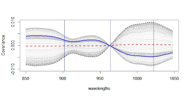
In the previous post we have seen  the correlation plot and in this one the covariance plot  matrix, we just have to change the function "cor" for "cov" in the code.
 
Covariance  matrix is used frequently in chemometrics, like in this case to define the ellipse for the Mahalanobis distance using the covariance between the two axes (one for the 964 wavelength and the other the linear combination of wavelengths 1022 and 902 that we have seen in other recent post.
 
We can do this easily with the package chemometrics and this code:

x3_x1x2<-cbind(x3,x1x2)
library(chemometrics)
drawMahal(x3_x1x2,center=apply(x3_x1x2,2,mean),
          covariance=cov(x3_x1x2),

          quantile=0.975,col="blue")

to get this plot:

16 abr 2018

Correlation Matrix plot

In the last posts we are talking about the wavelength space due to its high collinearity, because we want to select wavelengths with few correlation between them in order to develop a model.
 
In this task we can check the correlation matrix, which is better to check in a plot than with numbers. This is the plot for the soy meal samples in transmitance using the 100 wavelengths from 850 to 1048 nm in steps of 2 nm, so the correlation matrix is a 100.100 diagonal and symmetric matrix as can be seen in the plot.
 
The red line is the correlation of the 962 nm wavelength with all the rest including itself (1 in this case). The vertical blue lines are the wavelengths at 1022,902 and 962 used in the recent posts.
 
See the Correlation matrix plot and code: 
cor_Xcmsc<-cor(X_msc_centered)
matplot(wavelengths,t(cor_Xcmsc),type="l",

        xlab="wavelengths",
        ylab="Correlation",

        col="grey",ylim=c(-1.00,1.00))
par(new=TRUE)
matplot(wavelengths,cor_Xcmsc[58,],type="l",

        xlab="wavelengths",
        ylab="Correlation",

        col="red",ylim=c(-1.00,1.00))
abline(v=1022,col="blue")
abline(v=902,col="blue")
abline(v=964,col="blue")

14 abr 2018

ellipses and ellipsoids in the wavelength space

Let´s look to the plane from the previous post:
                            

We can see how the dots form like an ellipse, and this is a characteristic when plotting some wavelengths versus others.

In this case we see the ellipse in a plane but we can see them as well as ellipsoids in 3D or more dimensions.

13 abr 2018

Regression planes in R (wavelength space)

We have seen the high correlation between wavelengths in previous posts and how we can reduce the wavelength space from lower dimension plots. 

In the case of the 3 wavelengths selected in the previous post at 1022, 964 and 902 nm. 


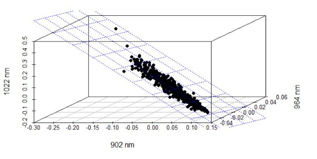
We can use the wavelength at 1022 nm as the dependent variable and to calculate a MLR regresión to predict the absorbances at this wavelength as a linear combination of the absorbances at 902 and 964 nm calculating a regression plane;

    #1022nm     datapoint 87    
  # 902nm     datapoint 27  
  # 964nm     datapoint 58   
x1<-X_msc_mc[,c(27)]  
x2<-X_msc_mc[,c(58)]  
x3<-X_msc_mc[,c(87)]  

s3d<-scatterplot3d(x1,x2,x3,pch=16,highlight.3d = TRUE,
                   angle=330,xlab="902 nm",
                   ylab="964 nm",zlab="1022 nm")       
fit<-lm(x3~x1+x2)
s3d$plane3d(fit,lty.box = "solid")


We can see the plane looking to the new regression plane plot:
 
x1new=-1.170e-16+(-2.122e+00*x1) 
x2new=-1.170e-16+(-1.061e+00*x2) 
#plot(x1new,x2new)
x12new<-cbind(x1new,x2new)
library(chemometrics)
drawMahal(x12new,center=apply(x12new,2,mean),
          covariance=cov(x12new),quantile=0.975,col="blue")


8 abr 2018

Intercorrelation between constituents and wavelengths


In the post "Linear Combinations to improve correlation" we selected three wavelengths where normally we found overtones for Protein, Fat and Fiber (Cellulose), and we found a linear combination of these three wavelengths to improve the correlation with the Protein constituent.
 
In this one we continue with the study of this data set. We have not just the Protein constituent, we have the values for Moisture, Fiber and Fat as well in the "Y" matrix and we want to check the inter-correlation between the constituents.
 
In the case we have NA values for some sample we won´t get the correlation value, and this is the case, so we remove first the samples with NA values and calculate the correlation between the constituents:

>Constituents<-Y[complete.cases(Y),]
>cor(Constituents)


           Protein     Moisture     Fiber       Fat
Protein   1.0000000  0.15406257 -0.83770097 -0.16767249
Moisture  0.1540626  1.00000000 -0.16143400 -0.09022824
Fiber    -0.8377010 -0.16143400  1.00000000  0.07874072
Fat      -0.1676725 -0.09022824  0.07874072  1.00000000

We see how we find a high negative correlation between Fiber and Protein, but this is normal in the case of soy meal.
But do we have high correlation between the absorbance of the wavelengths we associate with Protein and Fiber.

#1022nm  datapoint 87       Protein or Oil
#1008nm  datapoint 80       Oil or Water
# 996nm                     Oil or Water
# 902nm  datapoint 27       Cellulose      
# 964nm  datapoint 58       CH2 Oil       


> cor(X_msc[,87],X_msc[,27])
  
  [1] -0.9957298
 
plot(x1,x2,xlab="1022 nm  Protein?",ylab="902 nm Fibre?",
     col="green",main = "cor(X_msc[,87],X_msc[,27])")


7 abr 2018

Linear combinations to improve correlation

With the data from soy meal on IFT conveyor, I select three wavelengths for this demo:
# 1022nm     datapoint 87     Protein or Oil  
#  902nm     datapoint 27     Cellulose        
#  964nm     datapoint 58     CH2 Oil
          

x1<-X_msc_mc[,c(87)]
x2<-X_msc_mc[,c(27)]
x3<-X_msc_mc[,c(58)]


We have the values for Protein for these spectra.

Protein <- Prot

Let´s see the wavelengths in the mean centered MSC treated spectra

matplot(wavelengths,t(X_msc_mc),type="l",
        xlab="wavelengths",ylab="Absorbance")
abline(v=1022)
abline(v=902)
abline(v=964)

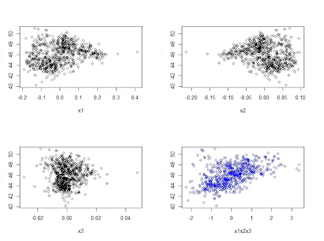
now see how the correlation becomes better in the case of the 4td plot where the X axis is a linear combination of the other 3 wavelengths
 
x1x2x3<-((139.98*x1)+(287.12*x2)+(121.02*x3))
par(mfrow=c(2,2))
plot(x1,Protein)
plot(x2,Protein)
plot(x3,Protein)
plot(x1x2x3,Protein,col="blue")
 
We have worked with this data before with PLS and PCR and what we have done here is a MLR approach. An intercept value will place the date on the same scale.
 

5 abr 2018

X spectra matrix redundancy

We know about the redundancy in the columns of the wavelength matrix X, where there is a high correlation between many of the wavelength so we should create new matrices to  represent the linear combinations of the X matrix.
 
In this picture, I select 3 wavelengths  of the 100 and we can see how two of them are highly correlated and the information can be represented in a plane indeed in a cube, so we change the space from 3 variables to just 2.
 
Columns X1 and X3 has a high correlations so they are dependent vectors because they go in the same direction. X2 goes in a different  direction so it is independent  from X1 or X3.

2 abr 2018

Linear Regressions to calculate the Loadings

We saw in previous post how the scores are calculated for every PLS term once we have the weights, so we start by t1 (scores on the first PLS term), and after we calculate the Loadings as regressions of X on T, so the loadings are spectra with values of "b" coefficients indeed absorbance. So they give us an idea of the importance of every wavelength in the term.
 
Every spectrum has 100 wavelength (850 to 1048 every 2 nm) so 850 is in the data point 1, 852 in the data point 2,........and 1048 in the data point 100.
 
So, we can make linear regressions on the X matrix (with its math treatment applied) on the score t1 calculated to get the value of every data point in the first loading.
 
The way to do it is:

lm(X_msc_centered[odd,10]~t1_pls)     #b=-1.247e-01
lm(X_msc_centered[odd,50]~t1_pls)     #b=-6.269e-02
lm(X_msc_centered[odd,90]~t1_pls)     #b= 1.348e-01


We can check after how this values are the same as the calculated for the PLS algorithm.